Ben Fraser is the Managing Director and Chief Investment Office of Aspen Funds. Prior to Aspen, Mr. Fraser was a commercial lender at First Business Bank specializing in government backed loan originations (SBA & USDA), for one of the top SBA lenders in the nation. Prior to that he was a commercial credit underwriter for Crossfirst Bank, personally responsible for underwriting over $125MM in C&I and CRE loans across a variety of industries.
Read more about Ben
We have been asked a lot recently by current and potential investors about how our funds are weathering the pandemic and whether there is any cause for concern given current economic circumstances. Very simply, our funds continue to perform well, and we have every expectation for them to continue to do so. Our monthly preferred returns have remained consistent and undisrupted. In fact, we continue to raise capital at a rapid pace from investors looking to diversify out of the stock market.
There remains a lot of uncertainty in the economy with a plunging GDP and high unemployment rates. But our founders, Jim Maffuccio and Bob Fraser, after suffering losses in two previous downturns, specifically designed the Aspen Funds’ business models to be robust and able to weather economic storms.
Investors have asked why the fund continues to perform well, and if we expect that to continue.
We don’t have a crystal ball, but we remain cautiously optimistic and have outlined 5 reasons why we expect continued strong performance of our Aspen Income fund:
Deep equity repositioning. Several years ago, we made a strategic and significant shift in our portfolio composition. We began shifting our portfolio to generally stronger equity positions that would be more capital protective. Our portfolio today reflects these efforts. Our overall portfolio Investment-to-Value (ITV, or cost basis relative to collateral value), is 60%, which means, on average we have 40% equity covering our positions.
Refinances. Given the continued low interest rate environment, banks today are slammed with requests for refinancing. Our borrowers too are refinancing, and unlike other lenders, when an Aspen loan gets paid off in a refinance, we profit. On average, Aspen pays 69 cents on the dollar for our loans. So, when one of our borrowers pays us off with a refinance at 100 cents on the dollar, we make a profit.
Solid price to rent ratios. A key underwriting factor we evaluate is the price to rent ratio of each asset. In most cases, Aspen borrowers pay far less to live in their home than if they rented. This creates a stickiness factor for current homeowners too, as it is cheaper to pay their mortgage than rent elsewhere. Additionally, this becomes an alternate source of cash flow in a worst-case scenario and we take the asset back
Home prices. Our economics research team has continued to uncover indicators of strength in the price of residential real estate. There is abundant evidence of strength underlying the housing market, especially in the entry-level & middle market. And with the Fed again stepping in to purchase mortgages, we will see mortgage rates driven to the floor, which will add further support.
Bankruptcies. We have seen a slight uptick in bankruptcy filings. But bankruptcies actually help Aspen. As a secured lender, our loan is preferentially treated by bankruptcy courts. Any unsecured loans wiped out by the borrower free up cash flow to pay the secured lenders like Aspen. And instead of relying on the borrower alone for payments, we now have the bankruptcy court enforcing borrower payments to Aspen.
Bottom line, this fund owns 470 great assets, in bread-and-butter homes across the US, homes that today have now become a family’s very sanctuary from the crisis.
If you have any questions on this fund’s performance, or would like any additional information, please feel free to reach out.
Ben Fraser is the Managing Director and Chief Investment Office of Aspen Funds. Prior to Aspen, Mr. Fraser was a commercial lender at First Business Bank specializing in government backed loan originations (SBA & USDA), for one of the top SBA lenders in the nation. Prior to that he was a commercial credit underwriter for Crossfirst Bank, personally responsible for underwriting over $125MM in C&I and CRE loans across a variety of industries.
Happy New Year! Hopefully, you’ve been enjoying the past articles on the economy and stock market valuations as we head in 2020, and have found some insights valuable. This will be the fourth article in our 5-part series. If you missed any of the last three articles, you can read them here:
In Part 4 of our series, we are going to discuss a topic many investors have heard of or seen headlines about – the inverted yield curve.
Let’s dive in.
Does the Inverted Yield Curve Signal an Impending Recession?
If there’s one economic headline that caused a lot of stir recently, it was the news the yield curve had inverted. This inversion has many investors in a panic about the future of the US economy. In the headlines it is typically touted as a sure-fire indicator of an upcoming recession (“An inverted yield curve has predicted the last 7 recessions”). And while we agree it is something to take note of, we have a slightly different outlook.
But we’ll get to that.
First, let’s look at what the yield curve is and why it inverts.
What is an Inverted Yield Curve?
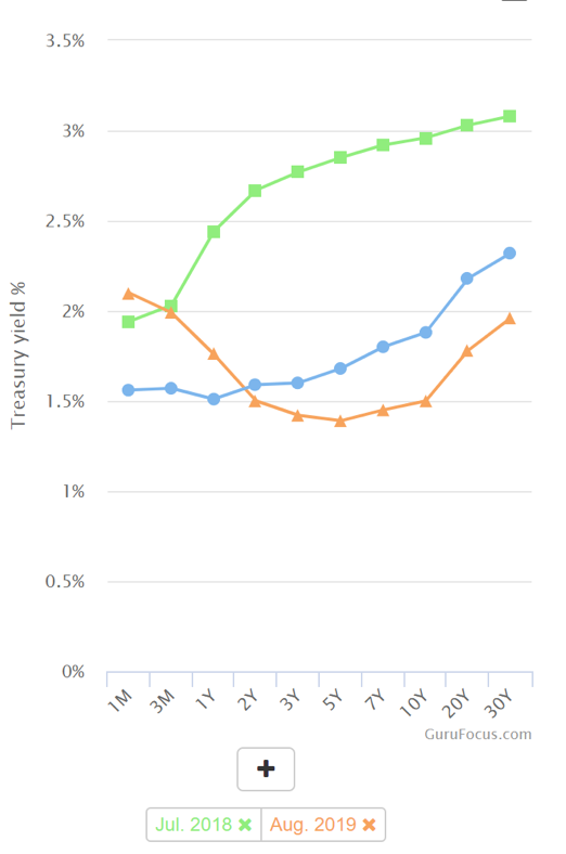
When you buy a bond, you receive interest payments in return, giving your bonds a “yield.” Typically, the longer the term of the bond, the higher yield you receive. For example, take a look at the yield curve chart below. Look at the green line, which is the “normal” yield curve from the summer of 2018. If you lent your money for 3 months, you would receive a 2.03% yield. If you went out to a year, you would get 2.44%; 10 years, 2.96%, and so forth.
But last summer, the yield curve inverted – meaning that longer term investments produced smaller yields. Look at the orange line. If you invested for 1 year, you would get a 1.76% yield, but if you lent for 10 years you would get just 1.5%.
Today’s yield curve (the blue line) is much more pedestrian, just a slight inversion between 3 months and 1 year.
Why Does the Yield Curve Invert?
Historically, watching the yield curve was helpful to see investors’ appetite for risk. Generally, investors will move more money from the stock market into the “safety” of bonds when they perceive greater risk in the economy. There has been a recent influx of cash into the bond market, and many are tying this to the volatility of the stock market. When investors pile into bonds, it drives down the long-term yields. (It’s worth noting that short-term bond yields are determined by the Federal Reserve’s monetary policy, while long-term bonds are dictated by the bond market. That’s why they change independently of each other.)
Now, this can happen when investors are pessimistic about the future of the economy or the stock market. But there are a lot more factors at play in the bond market that are important to consider.
What’s All the Fuss About an Inverted Yield Curve?
Here’s why many people are alarmed: an inversion of the yield curve has pre-dated a recession every time it has happened in the last 40 years. It’s surprisingly been a fairly accurate early indicator of recession, generally occurring 18-36 months before a recession.
Because of its historical accuracy, alarm bells went off when the yield inverted recently. And while an inversion is cause to investigate what is going on, we think it’s premature to say that the next recession is now inevitable.
In fact, we believe that a yield curve inversion has much less predictive power than it once did.
Here’s why.
Why the Inverted Yield Curve Might Not Be an Indicator of a Recession
Based on our research, there are 4 key factors that are creating “noise” in the yield curve. This noise is what makes an inversion a much less reliable indicator.
First, we’ve been in a long-term low-inflation period and will continue to be for a while (we covered some of these macro-trends in part 1 of this series). Low expected inflation, means lower expected future growth, which dampens long-term yields.
We also have an aging population and slowing population growth. This will generally cause long-term yields to decrease. Overtime, a larger percentage of the population will not be productively participating in the economy which lowers potential GDP growth.
Another overlooked factor contributing to the inversion is that the Fed has been buying bonds since the last economic crisis in 2008, driving yields down. The Fed’s monetary policy has created a price-insensitive buyer of bonds, which creates distortion in the market.
“The predictive power of this indicator requires greater context following the Federal Reserve’s unprecedented monetary accommodation during the financial crisis in 2008,” says Phillip Nelson, the Head of Asset Allocation at NEPC in Boston. “The central bank’s large balance sheet has driven Treasury term premiums to historic lows, potentially enabling more frequent yield curve inversions without the associated risk of a recession” (source).
Perhaps one of the biggest contributors to the noise in the yield curve is the global interest rate environment. The bond market is now not just indicative of the U.S. economy, but also reflective of the global reality. Several central banks have created negative interest rates. This creates a scenario in which lenders are effectively paying the government to borrow their money. As larger institutional investors, in Europe for example, are looking for yield and the only domestic option are bonds with negative interest rates, a better option is to invest US bonds with a currency hedge. International money has been moving into the US bond market, creating a lot of noise. The yield curve is now no longer just a predictor of US growth, it’s a predictor of US growth plus the lack of growth and yields of other countries’ markets.
The inverted yield curve has had predictive power in the past, but given all these reasons, it’s clear there’s a lot of extra noise in the bond market that makes this much less significant than it has been in the past. Capital Economics agrees: “Inverted yield curves in the US and elsewhere tell us very little about the timing of the future downturns and, for now at least, the economic data are more consistent with a slowdown than a downturn in the world economy” (source).
Or as the South China Morning Post puts it: “While an inverted yield curve could be taken as a sign that a recession is in the offing, US manufacturing activity and consumer sentiment remain robust. The inversion in US yields is more a by-product of excessively low yields in Europe and Japan” (source).
The Bottom Line
We’ll cover our view in more depth in our final post of this series, but in our view, record low unemployment and solid wage growth in the US, where 70% of economic activity is derived consumer spending, means we are extremely unlikely to see a recession anytime soon. The inverted yield curve is noteworthy, but more reflective of strangeness in the bond market than an impending recession.
The Final Post in our Economic Series
In the final part of our series we are going to be covering a topic we get asked questions most often on and is probably most relevant to our investors – the state of the U.S. housing market. There are a lot of factors to consider, so the next article will be dense with data, but we hope it will be very illuminating.
And as always, please feel free to share this with any investors you think would benefit.
If you want to make sure you don’t miss the rest of this series, sign up to receive updates and we’ll email it to you directly.
Ben Fraser is the Managing Director and Chief Investment Office of Aspen Funds. Prior to Aspen, Mr. Fraser was a commercial lender at First Business Bank specializing in government backed loan originations (SBA & USDA), for one of the top SBA lenders in the nation. Prior to that he was a commercial credit underwriter for Crossfirst Bank, personally responsible for underwriting over $125MM in C&I and CRE loans across a variety of industries.
In the last two sections of our economic analysis, we covered several of the key fundamental drivers of the economy and the direction of these “tides.” If you missed either of the last two articles, you can read them here:
In Part 3 of our series, we are shifting our focus from the U.S. Economy and looking at the stock market and valuation metrics.
Let’s dive in.
The Stock Market & Valuation
As we’ve discussed earlier, it is important to differentiate between the stock market and the economy, as they can sometimes be used interchangeably. Now that we’ve evaluated the data on the fundamentals of the economy, we will spend some time looking at the stock market.
The stock market has had an incredible run over the last decade. However, many investors are becoming increasingly nervous, and are questioning whether it can continue going up.
Market Valuation Metrics
You may have heard the term “value investing.” This subset of investing philosophy has been popularized by famous investors such as Warren Buffett – and for good reason – Buffett is the most successful investor in history. And simply, the philosophy espouses that the price you pay for an investment is just as important as the investment itself. For example, Amazon is a great company, but is it worth the price of its stock?
Price to Earnings Ratio
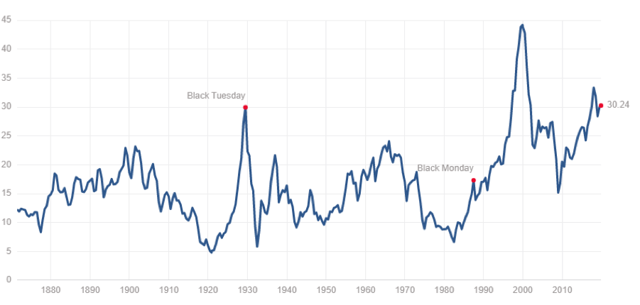
A simple measure of valuation is the P/E ratio (price to earnings ratio). This is the price of a given stock divided by the earnings of that company. Collectively, for the S&P 500, as of the time of this writing, the P/E ratio is 30x. That means effectively, a business that earns $1,000 per year would be valued at $30,000. Would you pay $30,000 for a business that puts $83/month ($1,000/year) in your pocket? In essence, that is what you are doing if you are buying the stock market right now. This ratio changes over time and, as you can see in the chart below, generally is higher before market corrections or recessions (though not always the case). At a 30x P/E ratio, the valuation of the stock market is historically expensive.
And many companies have a much higher P/E ratio, like Amazon, which is currently over 70x. Value investing is not the only way to make money in the stock market, but it is probably the most respected. And value investors are shunning this market. Buffett said in his most recent annual letter, “Prices are sky-high for businesses possessing decent long-term prospects.”
And it makes sense — the more you to pay for an investment, the less you are likely to profit. And in the mid-long term that is generally the case.
Modern money management theory has purported the idea that it’s always a good idea to be invested in the stock market, because, “over the long run, the stock market goes up.” Well, as you will see, that is not always true. Valuation has a large part to play in this and has been a great predictor of future stock market returns.
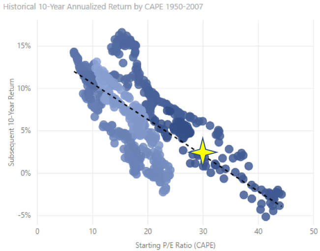
The Single Most Important Chart for Stock Market Investing
Historically, when P/E ratios were lower, it was a good time to buy stocks, and when P/E ratios were higher, it was a good time to sell stocks. We’ve put together a chart to display this relationship between valuation and future returns. As you can see in the chart below, there is a clear negative correlation between them. And again, it makes intuitive sense that the more you have to pay for something, the lower your future returns will be. Contrary to what your money manager says, you should not always be in the stock market.
This chart plots the actual historical P/E ratios over the last 60+ years relative to the subsequent 10-year annualized return. Each dot represents a monthly data point – the actual P/E ratio on the first of the month, and actual annual return you would have received over the next 10 years had you invested on that day. As you can see, there is a clear negative correlation – the higher the P/E ratio, the lower the annual returns. So, for example, when the P/E ratio was low (around 10x), over the following 10 years, the stock market return was 10% on average. But, when the P/E ratio was high, like during the internet boom in the late 90s when it was in the 40s, you would’ve earned -3% (i.e., lost money) over the next 10 years on average.
So where are we now, you are probably asking? With a current P/E ratio hovering around 30x, we are at the high end of the historical range. And if history is any predictor, you can expect the next 10 years’ annualized returns to be less than 5% (and Morgan Stanley agrees with us — see Don’t celebrate the Dow record too much, Morgan Stanley predicts dismal returns the next decade.)
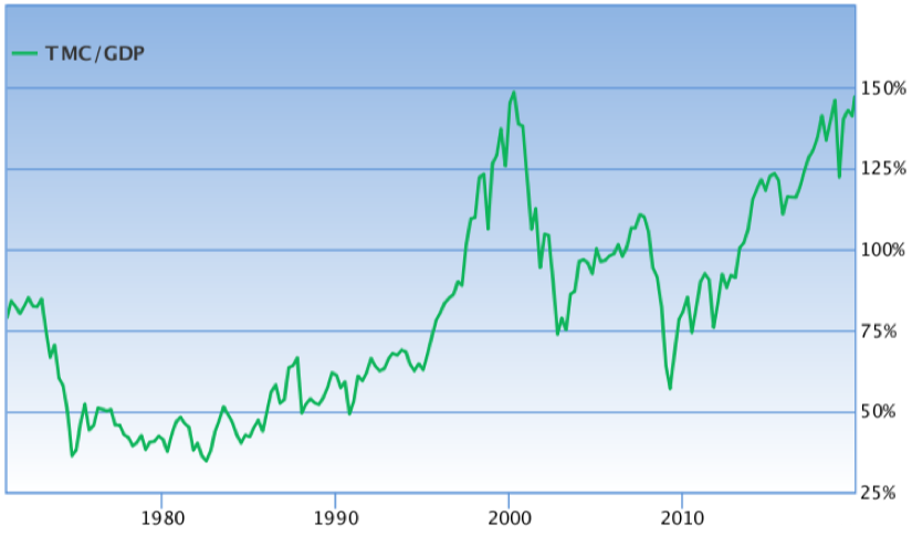
Warren Buffett’s Favorite Investment Indicator
Another valuation metric that is commonly used is the total Market Capitalization to GDP ratio. Very simply, this measures the total value of all publicly traded companies relative to the GDP, or the value of all goods and services produced annually. It is in essence the ratio of the stock market relative to the economy. This is one of Warren Buffett’s favorite ratios, who has stated, that it’s “probably the best single measure of where valuations stand at any given moment.” It gives a relative historical trend for valuations of the stock market. If you compare this chart to the historical P/E chart, you can see how similar they are.
Buffett, who is one of the most famous value investors, continues to hoard the cash of his company, Berkshire Hathaway. As of the writing, his total cash exceeds $120 billion and has been steadily growing. The primary reason for this has been Buffett’s opinion on prices being too high.
Don’t Short this Stock Market
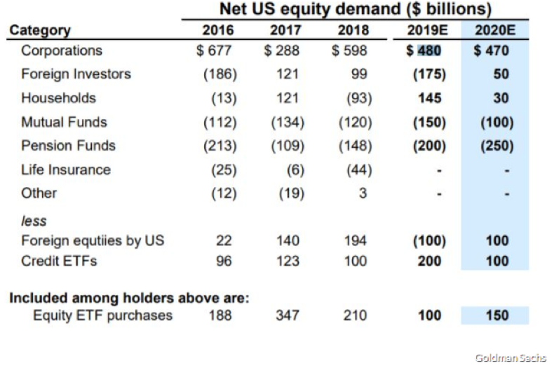
But, before you decide the market is overheated and it’s time to short the stock market (shorting is investing to make money when the market drops), it’s important to look at one of the key drivers of equity demand. As you can see in the chart below, the largest purchaser of equities over the last several years have been corporations through stock buyback programs. This is when companies spend their profits to buy their own stock. And buybacks are expected to remain high in 2020. Repurchasing shares can increase corporation’s earnings per share (EPS), as it reduces the number shares outstanding. Corporations are largely price insensitive buyers, so it isn’t wise to bet against them.
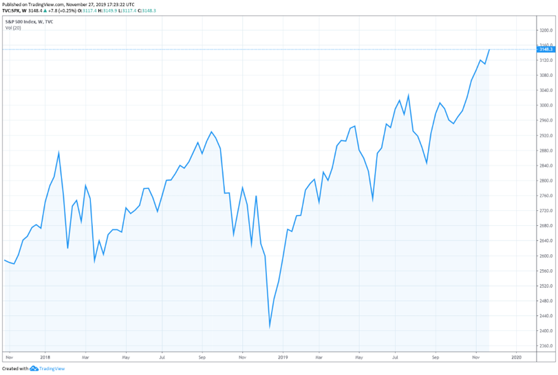
The other reason not to short this market is the 800-pound gorilla sitting in the corner – the Federal Reserve. At any time, they could decide to prop up the market by lowering rates or restarting their bond purchasing program, flooding the system with cash. And while we don’t see a lot of immediate downside in the stock market given the strong fundamentals of the economy, there also is limited upside, due to the high valuation and moderate economic growth. Two years ago, our economics team predicted the stock market would have an upside bias, but with a lot of volatility. As you can see below, this has proven to be true – the drawdowns have been sharp and frequent, but the upside bias is clear. Today our forecast for the next year remains the same: high volatility, but with an upside bias.
Volatility – Why Does it Matter?
This is an aside, but an important concept to understand. Though the stock market has had an upside bias, many investors don’t realize how volatility negatively impacts actual returns. Some may say that volatility is not a concern if you are a long-term investor, and despite the ups and downs of the stock market, over the long-term you’ll come out ahead. But what they don’t understand is that volatility kills compounding. Here’s a scenario that might change your mind.
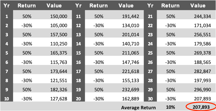
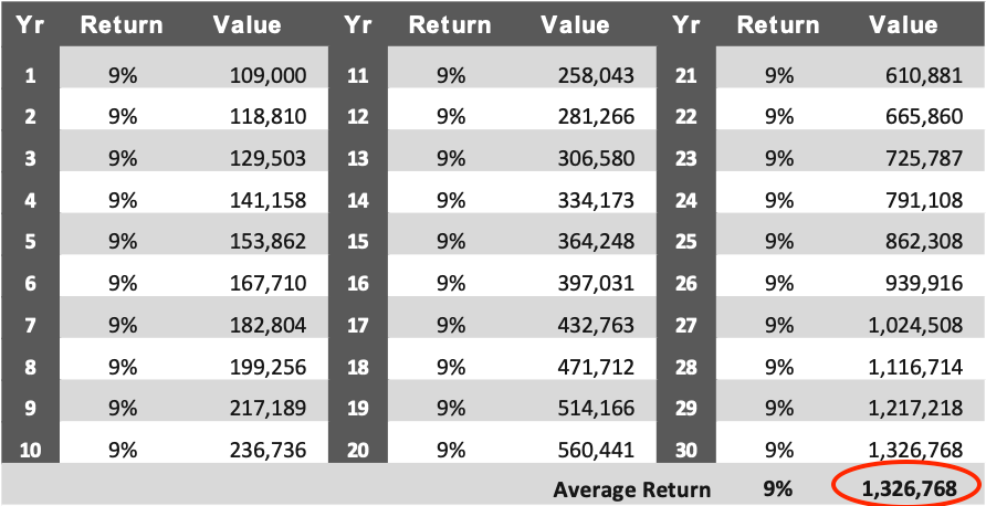
Below, are two scenarios where you initially invest $100,000 and let it grow over 30 years.
In Scenario #1, you invest the $100,000 in the stock market. You have big gains, but also big losses (i.e. volatility). But, your “average” return over 30 years is 10%. Not too bad, right?
In Scenario #2 you earn a boring, stable 9% return per year, every year.
Albert Einstein is purported to have said, “Compound interest is the eighth wonder of the world.” You can see below in Scenario #2 the incredible power of consistent compounding. Look at Scenario #2 below. A consistent, stable 9% return turned $100,000 into $1.3 million in 30 years.
Now look at Scenario #1. The average return is higher: 10% vs. 9%. You would expect the returns to be proportionally higher. But in this example, our investor yields are volatile – high then low year to year. Even though the average yield is higher, the overall return is six times lower. Volatility is kryptonite against the superpower of compounding.
What We Would Recommend
The fear surrounding the Coronavirus perfectly illustrates the volatility of the stock market, as we have witnessed large price drops. We expect more volatility throughout the year. Our recommendation for your holdings in the stock market is to remain long or reallocate. Again, we don’t advise shorting the market at this point, as there is still strong equity demand from corporations. But, given the valuation metrics, we expect continued volatility in 2020. Now is a good time to take some of your gains from the market and reallocate into alternative asset classes.
Thanks for reading our perspectives on the economy and the stock market. The final two sections of our economic analysis will cover a hot topic many investors have been about: the inverted yield curve. And finally, we’ll end our series with a look at the housing market.
Please feel free to share this with any investors you think would benefit.
If you want to make sure you don’t miss the rest of this series, sign up to receive updates and we’ll email it to you directly.
Ben Fraser is the Managing Director and Chief Investment Office of Aspen Funds. Prior to Aspen, Mr. Fraser was a commercial lender at First Business Bank specializing in government backed loan originations (SBA & USDA), for one of the top SBA lenders in the nation. Prior to that he was a commercial credit underwriter for Crossfirst Bank, personally responsible for underwriting over $125MM in C&I and CRE loans across a variety of industries.
Last week we shared Part 1 of our analysis of the current state of the U.S. Economy. We covered our approach to understanding economic “tides”, U.S. Employment and Household Income, and Consumer & Business Sentiment. If you missed last week’s analysis, you can read it here: 2020 Economic Forecast – Economy (Part 1)
In Part 2 of our series, we are still analyzing the state of the U.S. Economy and will look at GDP Growth & Monetary Policy and Inflation.
Let’s dive in.
GDP Growth & Monetary Policy
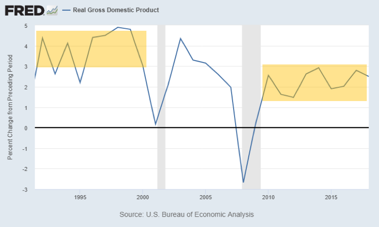
GDP is essentially the measure of economic activity in a country. This number represents the total value of all the goods and services produced in a country’s economy. We saw about a 4% real GDP growth in the 90s (during the internet boom), which was abnormally high for a mature economy. Now we’re seeing between a 1.5-3% real GDP growth since 2010. That’s solid growth. This slow but steady growth is a product of increases in productivity and the participation rate.
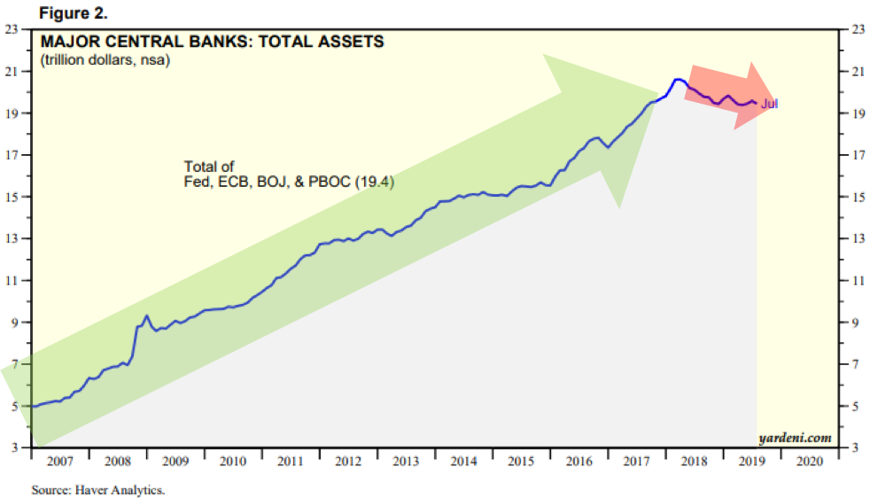
Meanwhile, globally, the central banks’ total assets have been increasing substantially since 2007, up until last year. When these central banks buy assets, they are essentially “printing” money to do so, sending infusions of cash into the economy and causing asset prices to go up (stocks, bonds, real estate). This is what’s been happening up until now. The Federal Reserve, European Central Bank, People’s Bank of China, and the Bank of Japan have been on massive money-printing programs since 2008. Their assets have grown from $5T total to $20T. These infusions of cash in the system act to keep interest rates low and encourage people to spend money.
When central banks print money, this liquidity flows into asset prices, including stocks and housing. This is why we’ve seen the stock market go on a tear, even in the midst of a slower growth economy. This has created another “tide” that buoys the stock market and housing market.
Since 2018, this growth in the central banks’ balance sheets has been declining slightly, including the Federal Reserve, which has eased off printing money. But the global economy is still awash in liquidity. And because the central banks have used an easy monetary policy before, without negative consequences, there’s nothing to stop them from doing it again if the economy begins to suffer.
Historically, the common belief was that easy monetary policy, like what we’ve seen in the last decade, would cause a rampant inflation, potentially even hyper-inflation. But, as we’ll cover in our next section, there are many systemic deflationary forces in the economy. These deflationary forces have prevented the monetary policy from creating unwanted inflation.
Inflation
The Federal Reserve’s mandates are generally to keep the unemployment rate low, as well as maintain price stability. And in spite of the global easy money policies, and against common wisdom, since inflation has remained stubbornly low. Inflation is basically non-existent right now and we predict will continue to be for the next decade, if not longer. The Fed’s inflation measure increased only 1.4% over the last 12 months. The reason inflation has hardly risen is because there are massive deflationary forces at work, holding inflation at bay.
There are 2 kinds of inflation: asset price inflation and consumer price inflation (CPI). Asset price inflation (i.e. stock market and housing prices) has been increasing substantially. But CPI has been flat. CPI has 3 main inputs, which are all in systemic, deflationary trajectories: wages, energy, and commodities. These long-term trends are keeping inflation relatively flat.
Wage Deflation
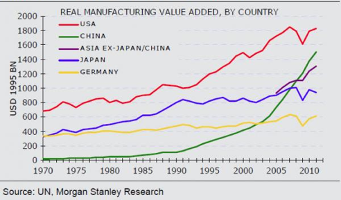
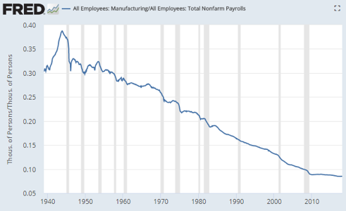
Manufacturing output has gone up since 1970 (first chart), however manufacturing jobs have steadily decreased (second chart). Why is this? Productivity, automation, better equipment. This is happening across many industries.
We have massive wage deflation primarily due to automation, aging population, and globalization. According to McKinsey, by 2030, 23-44% of current work hours will be automated. This means that between 8-33% of the workforce will need to change occupations.
Jobs like those in customer service will decrease with the rise in online systems. Efforts are underway to build automated burger flippers. Self-driving vehicle advances could replace Uber drivers and truck drivers in the near future.
While those with specialized skills can continue to earn more in a wealthier world, the rise of robotics and other technological advances provides a significant deflationary force on the median wage globally. As jobs disappear, more people are making less wages, compressing the median wage. Essentially, automation creates a cap on wages. At some point it’s cheaper to buy a million-dollar robot than to pay employees an inflated wage.
So what does this mean for the job market? Over the next 10 years we will see unemployment rates go up and participation rates go down, unless we see the economy remain strong and we retrain people to do jobs less susceptible to automation and keep unemployment low.
On top of this, demographically, the workforce is getting older and the working population is expected to fall as the global population growth rate slows. This will create downward pressure on potential growth and inflation.
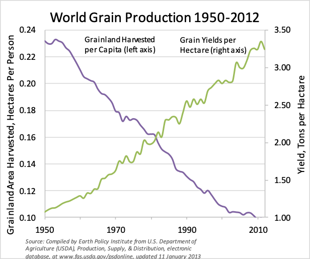
Food Deflation
Despite grainland area being harvested dropping significantly, the yield per hectare is increasing disproportionately. Rises in production output are due to global biotechnology advances which are significantly improving yields. In some parts of the world, we can now see multiple harvests from the same hectare within a calendar year.
Additionally, global trade has expanded such that food supply is now worldwide. We import and export grain, produce, and other commodities quite commonly. This insulates us from regional production shocks and shortages caused by droughts or other weather anomalies. These trends also act as deflationary forces.
Oil Deflation
In the 1970’s, oil was the major factor driving global inflation. Does anyone remember the Arab oil embargo? But many are surprised to hear that the US is now the largest producer of oil in the world. How did this happen? New technologies like horizontal drilling and fracking. Regardless of what you think about these technologies, they have unlocked massive amounts of oil reserves. On top of that, US energy consumption is now flat (this is due to a variety of factors like moderate GDP growth, populations driving fewer miles and using more efficient cars, and less trucking). So, if consumption is flat, production is soaring, then prices will fall. What will happen when US-pioneered production advances are deployed in the giant and super-giant oilfields in Russia, Saudi Arabia or Indonesia? We will never in our lifetimes see $100 oil again. By the time these technologies run their course, electric vehicles will be the dominant form of transportation and oil consumption will be in permanent decline.
Bottom line
There is still a lot of strength in the fundamentals of the economy: unemployment is near record lows, GDP growth is solid, consumer sentiment is high, and inflation is being kept in check. These are all positive signals for the economy.
Obviously, the long-term deflationary trends in wages are concerning, but those won’t create significant impact on the economy for some time.
Stay Tuned Next Week for Part 3 of 5
Stay tuned for parts 3-5 on the economy covering the stock market valuations, inverted yield curve and the housing market. After we cover those, we’ll share our thoughts on whether or not a recession is coming.
If you want to make sure you don’t miss the rest of this series, sign up to receive updates and we’ll email it to you directly.
Ben Fraser is the Managing Director and Chief Investment Office of Aspen Funds. Prior to Aspen, Mr. Fraser was a commercial lender at First Business Bank specializing in government backed loan originations (SBA & USDA), for one of the top SBA lenders in the nation. Prior to that he was a commercial credit underwriter for Crossfirst Bank, personally responsible for underwriting over $125MM in C&I and CRE loans across a variety of industries.
Recently, we have been frequently asked by investors about our perspective on the economy as we head into 2020. Are we heading into a recession? When will this happen? Will it be as bad as 2008?
Obviously, this is something on the forefront of investor’s minds. But, it’s also hard to give a succinct answer. We decided to put together our thoughts on where the economy is headed and other “hot topics” that many investors are thinking about.
We will be putting together a 5-part economic series that covers a variety of topics ranging from the U.S. economy, stock market valuations, inverted yield curve, and the real estate market. If you’ve had questions about any of these topics, we hope you’ll find value in our perspectives.
Our Economic Forecasting Approach: Macroeconomic Fundamental Analysis
Before we dive into the data, it’s important to take a step back and explain our approach to analyzing the economy. The news media has not done the average investor any favors. The stock market is up one day, and down the next. Catchy headlines dominate the conversations of the commentators. There is no real synthesis of the data, just noise.
It is important to differentiate between the stock market and the economy, as they can sometimes be used interchangeably. Generally, in the long-term, the stock market follows where the economy leads. Though, in the short-term, the stock market doesn’t always act in concert, and is anyone’s guess what it will do.
But, if you study the underlying fundamental data of the economy, you’ll have a good idea what the stock market will do in the mid-long term. We call this the difference between the tides and the waves. If you look at the stock market and the barrage of daily news, you’ll have a hard time determining what’s coming. But if you study the underlying economic data you can discover identifiable trends that underpin all investment classes, just like tides.
And finally, we focus our analysis on evaluating macro-economic data, or the key drivers of the economy and the direction they are heading. Our process is simple: look at as much meaningful data as possible and determine what the preponderance of evidence is suggesting.
Now we don’t have a crystal ball, but we do hope this series will be illuminating for you and hopefully shine the light into the drivers of the U.S. Economy and where it is headed.
US Economy
Unless you’ve been living under a rock or hiding in a cave, you’ve been hearing chatter about an impending recession. With all the news media and catchy headlines, it’s hard to know what is meaningful and what is noise. Our goal with this series is to take a comprehensive look at several facets of the economy and hopefully answer many of the questions on investors’ minds.
Our co-founder and CFO, Bob Fraser, has been a longtime economic researcher with an impressive track record, and mostly reserved his economic newsletter for our investors and friends. But we want this information to get into as many investors’ hands as possible so they can be prepared for what lies ahead.
Diving in deeper, we are going to look at the US economy from a variety of factors that impact economic health: employment, household income, consumer and business sentiment, GDP growth, money printing and inflation.
Employment
Despite all the political undercurrents surrounding our president, Trump’s tax plan has actually done what it was supposed to: jumpstart the economy, and it has done so, in precisely the ways Bob forecast two years ago. Boiled down, this tax plan aimed at rewarding business owners and investors, which in turn created more jobs and boosted employment rates. And when people start working, they become optimistic and spend money.
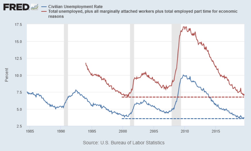
We are seeing steady gains in employment rates. Currently we are at the lowest headline unemployment rate (U3 – the number of people without a job actively looking for work) since 1969, now at 3.6%. This is the lowest it’s been in 50 years! Because 70% of the economy, as measured by Gross Domestic Product (GDP), is driven by consumer spending, low unemployment rates have a huge impact on the economy. If consumers have jobs and feel optimistic about their lives and futures, they will spend more freely, which then stimulates the economy.
Some recent claims have been made that the current state of the US economy is only helping those that are already rich, rather than the whole population. Well, the data says otherwise:
Black unemployment rates have fallen to 5.5%, setting new record lows
Hispanic / Latino unemployment rates, currently at 4.2%, are also setting new record lows
These are incredible trends. Minorities are getting jobs, some of them for the first time.
Think about when a person gets a job for the first time. They “enter” the economy. Well, then the GDP grows. They go buy a car, they make improvements to their house, they go to the doctor, they think about starting a business. This creates a massive amount of economic activity.
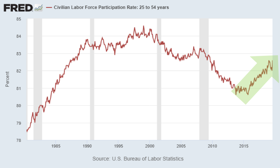
For the purposes of measuring tides, I prefer to look at broader measures of employment like the U6 rate, or the even broader labor force participation rate. This measures how many people are in the workforce relative to the entire working age population. This is important because it measures the percentage of the population that is contributing to the economy’s GDP. This measure has reversed its downward trend and skyrocketed since 2015 (despite an aging population). This signals that the population is hopeful and optimistic, so people are re-entering the economy. Whenever someone enters the economy, GDP grows.
Household Income
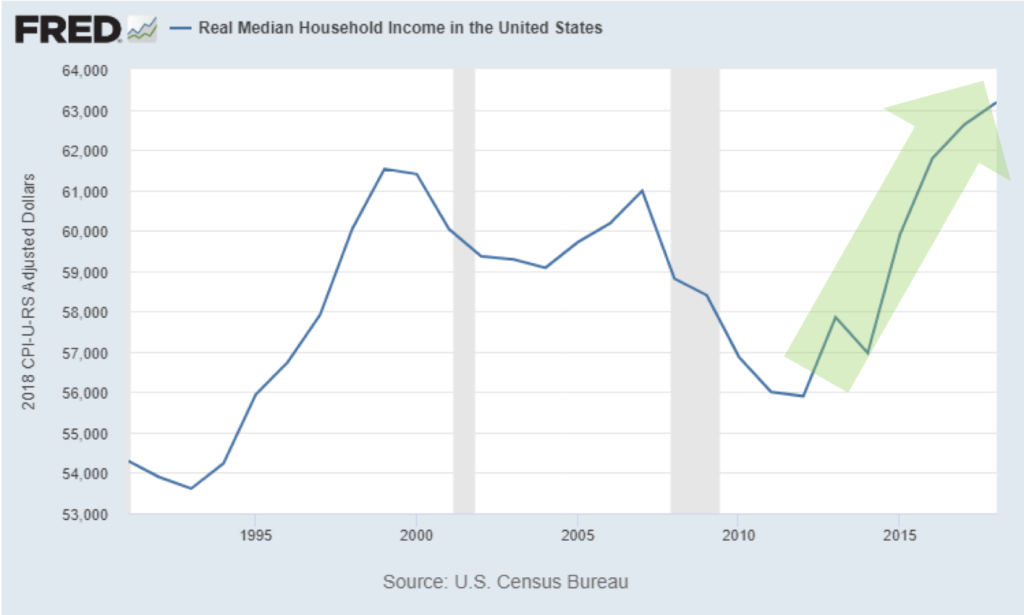
Household income is another measure that is important to consider. Real household income (which is income that has been adjusted for inflation) in the US rose during the 90s internet boom, but then has been flat or in decline since 2007. Starting in 2012, household income has completely skyrocketed. Real household income is now higher than both the late 90s and prior to the Great Recession. And this number is a median number (versus an average), meaning it’s not skewed by the wealthy making more.
Because inflation has been so low in recent years, it boosts real income growth. Each dollar goes farther. And real income is what boosts optimism. If people have some excess, they spend it – going out to the movies, to dinner, on vacation, etc. This excess contributes to a positive consumer sentiment, or optimism about the state of the economy.
Consumer and Business Sentiment
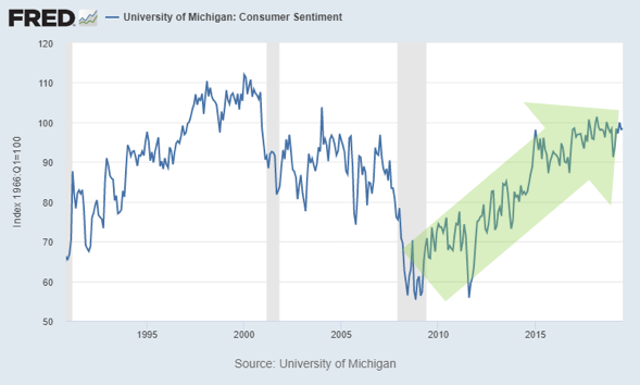
Consumer sentiment, which is an economic indicator measuring how optimistic consumers feel about their finances and the state of the economy, bottomed in 2009, but has been on a tear since 2010, though it is beginning to flatten. This indicates that despite the current political climate, consumers are still very optimistic about the economy and their finances.
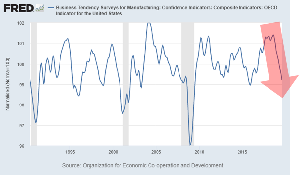
Business sentiment, on the other hand has been dropping. Business spending drives job creation and investment for future growth. If you run a business and are optimistic about your growth, you’ll go buy new equipment, hire more people, expand your operations, etc. This sentiment decline isn’t great, but it’s also not alarming.
You can see that that business sentiment changes much more frequently than consumer sentiment as they are concerned with taxation, regulation, interest rates, competition — and other factors outside general economic trends. So, it’s harder to determine clear trends in the data.
While business sentiment is important, it doesn’t bear as much weight overall as consumer spending, which again accounts for a majority of the GDP.
Stay Tuned Next Week for Part 2 of 5
Stay tuned as next week we will share the remainder of our analysis on the state of the U.S. economy. After that we will cover the inverted yield curve, the housing market, and current market valuations, and share our thoughts on whether or not a recession is coming.
If you want to make sure you don’t miss the rest of this series, sign up to receive updates and we’ll email it to you directly.
Ben Fraser is the Managing Director and Chief Investment Office of Aspen Funds. Prior to Aspen, Mr. Fraser was a commercial lender at First Business Bank specializing in government backed loan originations (SBA & USDA), for one of the top SBA lenders in the nation. Prior to that he was a commercial credit underwriter for Crossfirst Bank, personally responsible for underwriting over $125MM in C&I and CRE loans across a variety of industries.
Here’s a roundup of some high-quality podcasts on real estate, investing, and generating cash flow:
1.Old Dawg’s REI Network by Bill Manassero – This network is a community of people who are in or near retirement who are interested in generating increased cash flow throughout their retirement years.
And here’s an episode when our Co-Founder and CFO, Bob Fraser, was interviewed on the Benefits of Being a “Lienlord.”
2. The Real Estate Guys Radio Show – This show is a real estate investing talk program for investors with millions of downloads worldwide.
And here’s an episode when our Co-Founder and CFO, Bob Fraser, was interviewed on creating high-yield cash flow without the hassle.
3.Monumental by Evan Holladay – The Monumental podcast covers topics ranging from multifamily development to community empowerment.
And here’s an episode when our Co-Founder and CIO, Jim Maffuccio, was interviewed on creating a win-win-win scenario for investors, lenders, and borrowers.
And here’s an episode where our Co-Founder and CFO, Bob Fraser, was interviewed on how to generate consistent income through real estate notes.
6.Dwellynn Show – Dwellynn is a Multifamily investment firm with a focus on acquisitions, repositioning, development, and management of affordable, yet quality, multi-family residential properties.
7.Cash Flow Hustle by Justin Grimes – Provides actionable insights for those seeking to create wealth through additional income streams
And here’s an episode where our VP of Finance, Ben Fraser, was interviewed on the Power of Passively Investing in mortgage notes.
8.Before the Millions by Daray Olaleye is a weekly podcast where millionaires share their best strategies to help people create and build a lifestyle business through real estate investing.
And here’s an episode where our Co-Founder and CIO, Jim Maffuccio, was interviewed on lifestyle design through distressed mortgage notes.
9.Chain of Wealth with Denis and Katie provides money tips & strategies for people looking to achieve incredible things with their finances.
And here’s an episode where our Co-Founder and CFO, Bob Fraser, was interviewed on one of the most effective and overlooked avenues of real estate investing: residential mortgage notes.
10.How to Lose Money by Paul Moore and Josh Thomas is a wealth-building podcast dedicated to the honest stories of business and life lessons learned.
11.Money Savage by George Grombacher is a podcast with a savage approach to personal finance featuring financial professionals and subject matter experts, released five days a week.
And here’s an episode where Jim Maffuccio shared on the pros and cons of real estate note investing, what to expect from the process and how to become successful doing it.
12.The Money Advantage by Rachel Marshall helps business owners build financial freedom with cash flow strategies, Infinite Banking, and alternative investments.
13.Smart Real Estate Coach is designed to help people reach the next level of real estate investing no matter their starting point.
14.Wealth Standard by Patrick Donohoe – The Wealth Standard Network is a collection of podcasts focused on investing, financial strategies, and building wealth.
And here’s an episode where our Co-Founder and CFO, Bob Fraser, was interviewed on mortgage note investing.
15.The Titanium Vault by RJ Bates – The Titanium Vault unlocks the secrets to real estate investing and entrepreneurship.
Ben Fraser is the Managing Director and Chief Investment Office of Aspen Funds. Prior to Aspen, Mr. Fraser was a commercial lender at First Business Bank specializing in government backed loan originations (SBA & USDA), for one of the top SBA lenders in the nation. Prior to that he was a commercial credit underwriter for Crossfirst Bank, personally responsible for underwriting over $125MM in C&I and CRE loans across a variety of industries.
You may have heard the phrase “cash is king.” From my days as a business banker, this was drilled into my head as one of the keys for evaluating deals. The idea is twofold. One, businesses or investors should have substantial cash reserves. And two, when evaluating financial statements, what may be reported as income coming in does not always equate to cash coming in the door. This is related to how income is accounted for.
I would like to take this one step further.
Applying this to a personal investing strategy, “cash flow is king.” A subtle difference. But it makes all the difference in the world.
Why Cash Flow is Important for Investors
Most investors are taught that to be able retire, they need to build a large nest egg for retirement – usually invested in the stock market. Then, once they hit retirement age, they can then “safely” withdraw 3-4% per year without running out of money.
This presents two problems: 1) the hurdle for most people to replace their current lifestyle becomes very high if you can only withdraw 3-4% per year, and 2) your wealth is not backed by any hard assets. And as we’ve all experienced, the stock market is very volatile. You are putting a lot of trust in the financial system.
Robert Kiyosaki blew this concept out of the water in his perennial best seller, Rich Dad Poor Dad. Very simply, his strategy is to invest in assets that produce cash flow.
As most investors approach retirement, cash flow is the crucial, important piece and yet the huge gap in their portfolio. Fixed income investments don’t yield much and are very volatile.
Two investor scenarios that demonstrate the value of cash flow in retirement
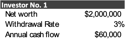
Investor No. 1:
He has slaved for 30 years working for a salary in a job that wasn’t his dream job. His boss made his life difficult, but it was manageable. He was diligent to put money away and wanted to provide for his family’s future. He ended his career making a salary of $150,000 per year. He followed the traditional advice of putting everything into low cost mutual funds or ETFs. He was able to build his net worth to $2,000,000. He is ready to retire, but is still unsure he’ll have enough to last. His financial advisor is telling him he can “safely” withdraw 3-4% per year, but he might as well err on the conservative side of 3% to be sure.
His before-tax annual cash flow will be $60,000. Now $60,000 is nothing to scoff at, and surely his expenses will be less once he retires (at least he thinks so). But he was used to making $150,000 per year, so he may need to downgrade his lifestyle. Further, what is this cash flow backed by? The expected future performance of the stocks that comprise his mutual funds. There are no hard assets.
Let’s move on to Investor No. 2.
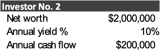
Investor No. 2:
This investor is still young; she’s only been in the workforce for 10 years, and has had a successful career thus far. She makes a good income of $80,000 a year, but has a lot of room left to run in her earning power. Instead of just focusing on growing her salary, she has been consistently accumulating assets and investments that are generating strong cash flow. She’s purchased several single-family homes, she’s bought mortgages notes, and is also a passive investor in a multi-family property and a mortgage note fund (like our Income Fund). Overall, her annual return is 10%. This is not an uncommon return.
Say she works for a full career similar to our Investor No. 1 and is able to build a net worth of $2,000,000. She also ends her career making a salary of $150,000 per year. However, instead of mindlessly putting money away into the stock market, she has gone against the tide and has continued to build her investment portfolio with various types of real estate, notes, oil & gas, and other alternative investments.
Her annual cash flow from investing activities on the same amount of net worth is $200,000, well above her previous salary. On top of this, her investments are backed by hard assets, which are less volatile. She worries a lot less than Investor No. 1 and makes over 3x what he does.
But, our Investor No. 2 is still young and she doesn’t want to have to work for 25 years in a job she doesn’t love. She wants to travel, and explore other countries. Let’s also say she is happy living on an income of $60,000 a year, like our Investor No. 1. She would rather have the flexibility and be financially independent. How much in net worth does she need to generate $60,000 annually? At a 10% return, the answer is obvious, $600,000.
How much quicker is she able to reach $600,000 versus $2,000,000? This is a made-up example, but the answer is much quicker! Some would say that she shouldn’t retire with only $600,000 in net worth, but that’s not the point. She could if she wanted to, because she has some strong passive income. She now has the flexibility and financial independence that many dream of. This is why cash flow is so important.
Another aside that should not be overlooked are the tax implications of the two strategies.
Investor No. 1 – to the extent he’s invested with a Roth IRA, he will have tax free income. But the contribution limits are restrictive, so it’s more likely that his investments are held in traditional IRAs/401-Ks (that he now has to pay taxes on) or invested in non-tax sheltered accounts. This will substantially reduce the amount of income after-tax income that he will take home.
Investor No. 2 – when you invest in direct investments (either in a private fund or directly purchasing an asset like real estate), you generally get direct ownership of that asset. As a direct owner, all of the tax benefits get passed through to you. This investor has substantial tax benefits such as depreciation and long-term capital gains that allows her to keep more of her income.
Clearly Investor No. 2’s situation is much more appealing. The problem is that most investors think this is unattainable. But what we find is it comes down to lack of education. There are more good opportunities that any one person could ever invest in. It’s knowing where to look.
Ben Fraser is the Managing Director and Chief Investment Office of Aspen Funds. Prior to Aspen, Mr. Fraser was a commercial lender at First Business Bank specializing in government backed loan originations (SBA & USDA), for one of the top SBA lenders in the nation. Prior to that he was a commercial credit underwriter for Crossfirst Bank, personally responsible for underwriting over $125MM in C&I and CRE loans across a variety of industries.