UPDATE: To see more recent economic forecasts, check out the summer 2021 Housing Market Projections update and the Inflation economic impact update.
Part 5 of our series on 2021 economic predictions covers the stock market. Topics include the business valuations in the S&P 500, P/E ratios and subsequent historical and projected earnings, and our predictions of who will be the 2021 winners.
S&P 500 Overweights Tech Giants – And Their P/E Ratios are Insanely High
When people go to invest in the stock market, it’s very popular to simply invest in an index like the S&P 500. But a very important element to know is that all the indices like the S&P 500 are overweighting a few tech giants, and their PE ratios are extremely high.
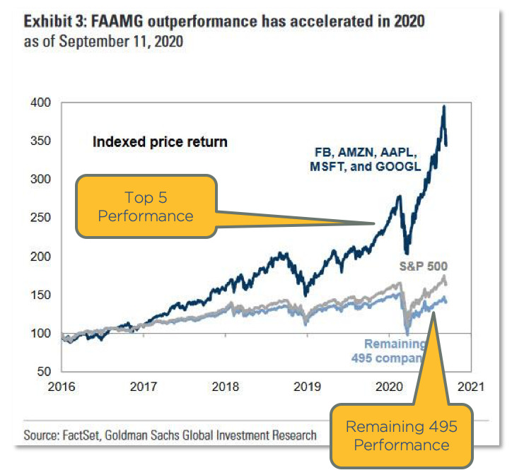
The dark blue line in the chart below shows the top five companies in the S&P 500: Facebook, Amazon, Apple, Microsoft, and Google. You can see how much they are affecting the S&P 500. And you can see the other 495 stocks down below with the light blue line. The tech guys are on fire.
P/E Ratios of The Tech Giants
What is a P/E ratio? P/E ratio is the price per share divided by the earnings per share. Essentially, it’s how much you’re paying for a stock relative to its earnings. Here’s an example. Amazon is at a 93 P/E ratio. That is like paying $93,000 for a business that earns $1,000 per year. That’s in essence what you’re doing if you’re buying a share of Amazon stock. These tech giants are very pricey on any basis you evaluate.
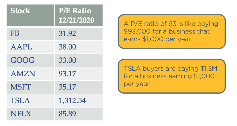
Tesla, which was just added to the index, is actually just above a 1300 P/E. Following our same example, when buying Tesla shares, you are essentially paying $1.3 million for a business that’s earning $1,000 a year. It sounds extreme; would you pay that much for a business with $1,000 in earnings? Well, the answer is yes if it’s Tesla. So clearly the valuations are just insane right now.
Valuation is the Bigger Issue
The total stock market price to earnings ratio is at 33, which means on average, investors are paying $33,000 for $1,000 of earnings. The entire reason for buying a business is to earn money, so this is definitely a caution zone.
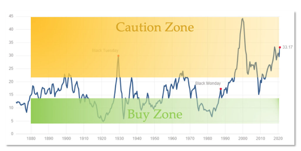
You can see previous peaks in 1929 and the 2000 dotcom bubble. We’re currently higher than a lot of people are comfortable with. Why does it matter? Well, it makes sense that the more you pay for something, the less likely you’re going to profit from it when you sell it, right? The bottom line is price to earnings ratio matters. You want to buy when stocks are cheap and sell when they’re high, not buy when they’re expensive.
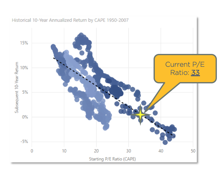
This is a scatterplot chart, and each dot is one month in history since 1950. The chart plots the P/E ratio at that time along the X axis, and shows historical returns annualized over the following 10-years. So had you bought on January 1st of 2000 at a 40 P/E ratio, your returns over the next 10 years were -5%. This is historical fact. Had you bought the stock market at that point and at that 40 P/E, you would have lost 5% per year over the next 10 years.
You can see, this is not a random chart, but there is actually a correlation between P/E ratio and future gains. So contrary to what modern portfolio theory asserts, that one should always be in the stock market, it matters what time you are in the stock market. History shows that valuation and timing greatly affect returns. You can time the stock market, and it’s best to invest when the stock market is cheap.
So where are we now? Well, at a 33 P/E, that puts us where the star is, right on the trend line. You can see right there that we’ll likely see returns in the -1% to 5% range over the next 10 years if history is any indication of the future. So, not great. The P/E ratio has been a very good predictor of future stock market returns.
The “Buffett Indicator” – Total Stock Market Value / GDP
The “Buffett Indicator” is what Warren Buffett claims is the best single measure of where valuations stand at any moment. Buffett is the most successful investor of all time. He started with very little and has created billions of dollars in wealth. He has said that what he looks at is the total stock market value relative to the size of the economy. If the stock market is valued more than the entire economy, it’s probably overpriced since it derives its value from the economy. And if it’s a fraction of the economy, then it’s probably a good price. And so you can see in 1999, it was not a good time to invest in the stock market. You would have had some losses.
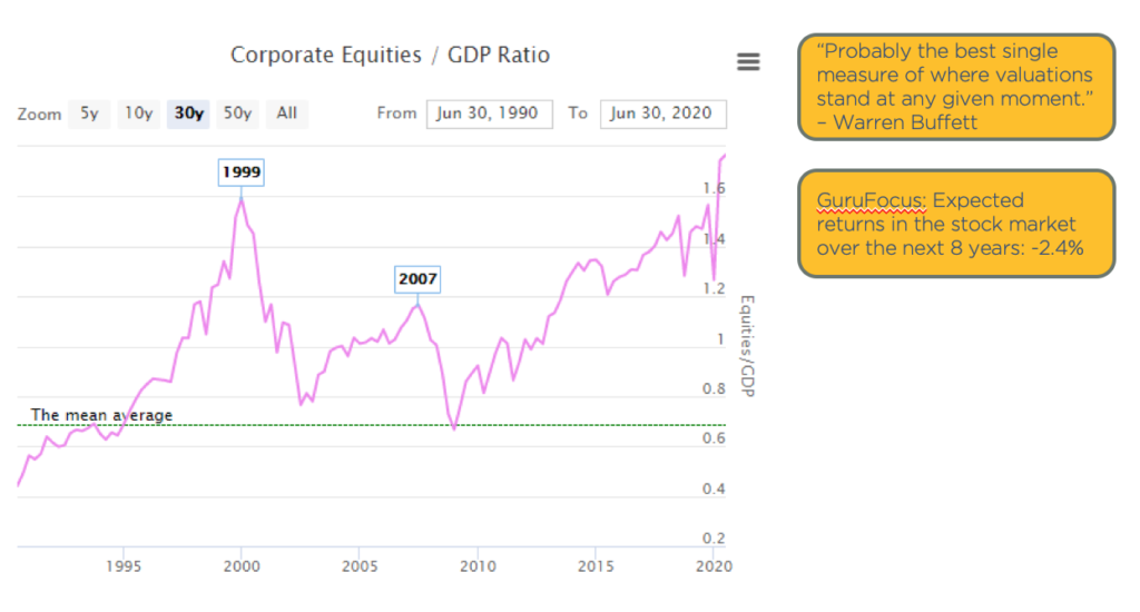
The green line in the above graph is the mean, the long-term average. This chart only goes back to 1990, but you can see we’re at a record high. So again, it shows the stock market is high.
A quick note, why is the stock market so high? This is the result of liquidity and of the massive stimulus programs. Some of that liquidity flows into the stock market. As an example, if you could borrow $1 billion at a 1% interest rate, what would you do with it? Well, you might buy stocks, and then stocks go up. And not based on value necessarily, but based on the fact that you think someone else is going to pay a higher price than you will pay, regardless of what the actual earnings are.
Crashes & Drawdowns
One of the things that is underestimated in the stock market is the risk versus reward. It always amazes me that financial advisors tell people to be in the “safe” investment of the stock market versus alternative investments, which is our space. Many alternative investments do not have nearly the volatility of the stock market.
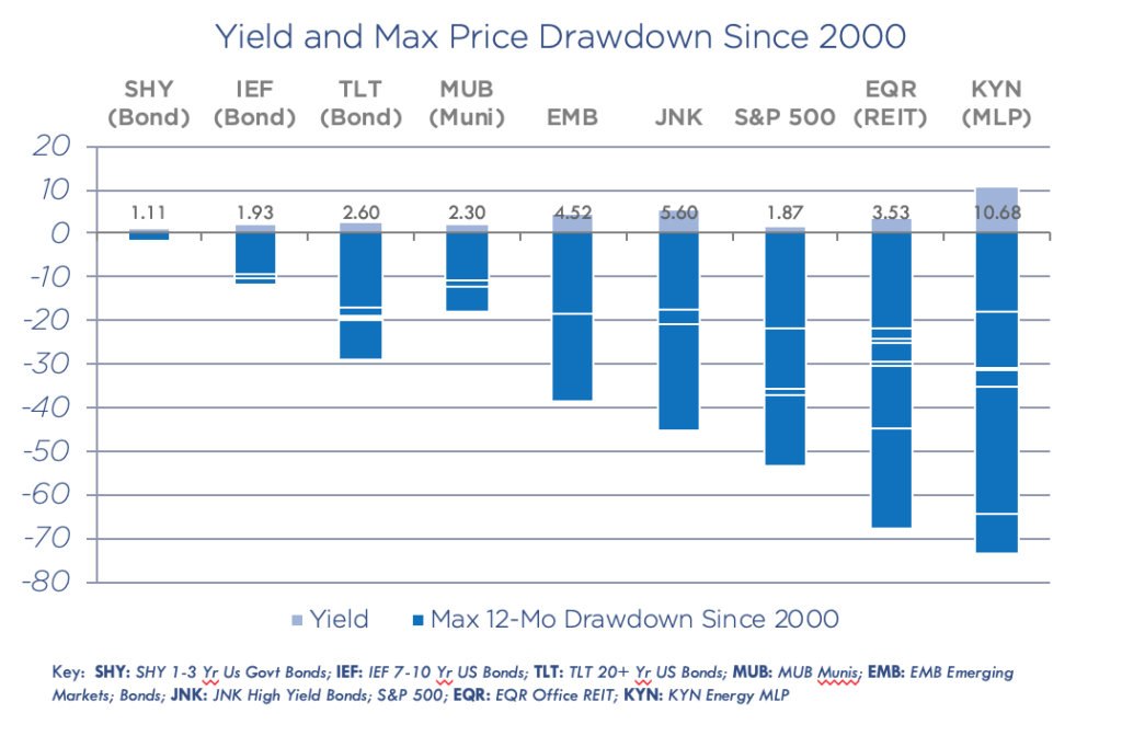
Let’s look at the historical data since 2000. The above chart shows the yield and max price drawdowns of many popular investment stocks. With KYN, there have been 6 drawdowns of 20% or more, some as high as 70%. This means one morning you could have woken up and lost 70% of your investment. There have been 6 of these just since 2000. With EQR, which is an office REIT, there have been 7 drawdowns of 20% or more.
These drawdowns are significant. In order to get a 3% yield, investors take a 60-70% risk. And it’s the same in the S&P 500. In the stock market, people are stretching for income unaware of the volatility risk.
Why Volatility Matters
Without volatility, we can see the magic of compounding. It was Einstein who said, “compound interest is the 8th wonder of the world.”
Let’s take a look at a couple scenarios.
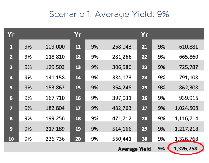
Scenario 1. You invest $100,000 and hold it for 30 years, and your average yield is a consistent 9%. At the end of 30 years at 9% growth, you have $1.3 million. That’s the power of compounding.
But here’s a comparative scenario. Scenario 2. You again invest $100,000 over 30 years, and your average yield is 10%. But in this case, you gain 50% one year, lose 30% the next year, and so on, but your average is still 10%. At the end of 30 years, you end up with just over $200,000, a fraction of what you earned with a consistent 9%.
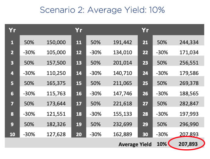
Volatility is the destruction of compounded returns. People should avoid volatility wherever possible.
Bottom Line – Where the Stock Market is Headed in 2021
- We will see a continued upward climb, but with volatility.
- Stocks will benefit from a global stimulus. When new money is printed, asset prices rise. Anything that can’t be printed goes up in value, including stocks, real estate, gold, Bitcoin, etc
- Valuations are generally unattractive
- Indexes are increasingly plagued by concentration risk,
- All these factors increase volatility
- The outsize opportunities in my opinion for 2021 are:
- REITs with lodging and retail exposure. Currently, some are down as much as 90%.
- Regional banks. Again some are down 70 to 80% still, and they have not yet participated in the big gains, so they’re laggards.
- Entertainment shares like movie theaters, IMAX, etc.
- And also energy has been pummeled. Although I think caution is in order because oil prices are capped by untapped production and technology. The largest oil producer in the world is the United States, and it’s due to technology. And since this technology has not even been deployed in other oil producers like Siberia, Russia, and Saudi Arabia, oil prices are capped. As soon as prices rise, you’re going to see production increase and flood the market. So I’m not very excited about energy in general, but there will be some outsize opportunities in the 2020 laggards.
Recap & Next Article
Up to this point, we’ve covered what happened economically in 2020, where we believe the economy is headed in 2021, how Biden’s proposed tax plan with impact the economy, and where the housing and stock markets are headed.
Next article in series: Aspen Funds
Related Articles
2021 Economic Forecast – Pt. 1 – The Economy
2021 Economic Forecast – Pt. 2 – COVID19 Recovery
2021 Economic Forecast – Pt. 3 – The Biden Tax Plan
2021 Economic Forecast – Pt. 4 – Housing Market


