Mr. Fraser has 20+ years’ experience as a finance and technology executive and is a former E&Y Entrepreneur of the Year Award winner. In 2012 Fraser co-founded Aspen Funds, a fund management company focused on mortgage investments. Fraser is responsible for financial management, portfolio modeling, as well as systems and processes, designing and deploying Aspen’s scalable state-of-the-art back-end platform.
The “energy transition” narrative has been dominating our headlines for some time now. It seems like every day, there’s a new report about our shift from fossil fuels towards greener energy sources – which is important. But as we recently discussed on our live masterclass with oil and gas industry veteran and CEO of Mohajir Energy Partners, Jeff Mohajir, the truth of this transition is not as cut and dry as it appears.
“Oil & Gas Masterclass: How to Evaluate Energy Investment” Resources:
The common narrative is that electric vehicles – that a replacement for our gas-guzzling cars, trucks and SUVs are the savior of our fossil fuel based economy. But Jeff offered a crucial counterpoint: “The more electric cars there are – the more batteries there are – it’s gonna take more natural gas to generate that power,” Jeff explained. Natural gas and coal generate 60% of US electricity. Renewables generate 21%. It’s a point that offers an important counter-narrative to the mainstream view, highlighting the complex reality of our evolving energy landscape.
As the global economy makes strides towards decarbonization, it’s crucial to remember that carbon-based fuels are still the predominant energy source. They currently account for 83% of all energy sources, while non-carbon sources, despite growing steadily, still constitute just 17%. As I often point out, we don’t switch energy sources like we change clothes. The process is gradual, and carbon-based fuels will continue to be a key part of our energy matrix for the foreseeable future.
“The more electric cars there are – the more batteries there are – it’s gonna take more natural gas to generate that power.” – Jeff Mohajir, CEO of Mohajir Energy Partners
While electric vehicles (“EVs”) are undoubtedly less carbon-intensive than their fossil-fuel-dependent counterparts, it’s important to remember what powers them: electricity. And presently, the lion’s share of electricity is generated from fossil fuels, particularly coal and natural gas. Consequently, an increase in EV usage equates to an increase in demand for power, which, in turn, requires more fossil fuels for generation.
Furthermore, the push towards greener technologies brings its own set of challenges. As we ramp up production of EVs, the demand for critical minerals like lithium, cobalt, and nickel is skyrocketing. We need about 40 times the lithium production between now and 2040. Such a massive increase in production will require considerable energy, and currently, fossil fuels are the only source of energy to extract and refine these materials.
Moreover, oil and gas play an essential role in our global economy’s logistics. As Jeff pointed out in our masterclass, “the only way to efficiently move mass [from one place to another] is through liquified petroleum.” Be it shipping, aviation, rail transport or trucking, liquid petroleum is the only means. Until we develop an alternative that can efficiently replace them in their vital transportation role, our reliance on these resources will persist.
“Carbon-based fuels are still the predominant energy source. They currently account for 83% of all energy sources.” Bob Fraser
Undeniably, the ESG (Environmental, Social, Governance) narrative has had a significant impact on the oil and gas industry, particularly during the ‘08 recession. Reduced energy demand coupled with the growing focus on ESG principles led many to view oil and gas as a dying industry. However, this perception fails to take into account the enduring demand and necessity for these resources. As Jeff astutely noted in our oil & gas presentation, “We are a carbon-based economy and we will be for the foreseeable future.”
So, why invest in a sector that many perceive as being on its way out? The answer is simple: it’s not. The narrative of oil and gas as outdated relics of the past is a gross oversimplification that ignores the complex realities of our global energy system. As we navigate through this transitional phase, oil and gas are poised to play an integral role, offering significant investment opportunities for those who recognize their enduring value.
A nuanced understanding of the energy sector is vital for investors looking to make informed decisions. A black-and-white view of the energy transition risks overlooking the shades of gray that reflect the complexity of our global energy system.
The future of energy will not be a simple shift from carbon to non-carbon sources. Instead, it will be a gradual transition, with oil and gas continuing to play a significant role. By acknowledging these truths, investors can make the most of the opportunities that lie ahead, in what is a vibrant and vital industry. It’s not about turning our backs on the future; it’s about understanding it in its entirety. As the energy landscape evolves, so too must our investment strategies. And in the complex mosaic of the energy transition, oil and gas remain critical pieces of the puzzle.
Key Takeaways
Fossil fuels, including oil and gas, remain crucial in our energy matrix, powering 83% of all energy sources and the charging infrastructure for electric vehicles.
The extraction of critical minerals for green technologies, such as lithium, cobalt, and nickel, heavily relies on energy from fossil fuels, reinforcing the sector’s relevance.
Oil is indispensable in global logistics, powering the efficient movement of mass via shipping, aviation, rail transport and trucking.
The ESG narrative often underestimates the enduring demand for oil and gas, overlooking the sector’s potential for significant investment opportunities.
The energy transition is a complex process, not a simple shift from carbon to non-carbon sources, and oil and gas will continue to play a significant role, indicating the sector’s investment potential.
Aspen Funds is pleased to introduce our latest Oil & Gas Fund, 116 Upstream Energy Fund VI, a 506c offering. This $50MM fund has been created to acquire diversified holdings of Non-Operating Working Interests & Overriding Royalty Interests of middle-market opportunities (focusing on PDP & PUD) partnering with larger operators in proven basins.
Mr. Fraser has 20+ years’ experience as a finance and technology executive and is a former E&Y Entrepreneur of the Year Award winner. In 2012 Fraser co-founded Aspen Funds, a fund management company focused on mortgage investments. Fraser is responsible for financial management, portfolio modeling, as well as systems and processes, designing and deploying Aspen’s scalable state-of-the-art back-end platform.
Join Our Mailing List
Get the latest in investing advice, industry news and updates on our current and new offerings
Oil and gas prices have been on the rise, but what does this mean for passive investors?
One of the biggest contributors to the high-inflationary environment is high oil prices. This has caused us to really take a deeper look at what’s going on in the market. Are there some bigger trends at play that can create opportunities for investors?
Here we’ll dive into the global energy dynamics and the mega shift happening in the energy market. We’ll also really evaluate energy as an investment and the opportunity here.
A Shift in Oil Demand and Subsequent Decline in Oil Investment
Let’s start with a look at the dynamics surrounding the global narrative around oil and resulting production.
This chart maps out investment into energy projects globally since 2010, in billions of dollars. Across the globe, this increased from 2010 to 2014 with over trillion dollars per year in 2014. But then suddenly in 2015, investment took a massive dive and has kept dropping until 2020, down 55% from its peak.
So what happened?
A brand new and dominant narrative surfaced that said fossil fuels had reached peak demand. And as surprising as that may sound, it’s not that unreasonable.
Because the push for fossil fuel conservation had been working, combined with low population growth and low economic growth throughout the Obama era, demand for fossil fuels was flattening.
In response to the narrative that fossil fuels reached peak demand, large energy companies began to divert investment to green and renewable energy projects, and stopped investing in big fossil fuel projects.
This makes sense. If you believe that the demand for your product is going down, are you going to invest in a 50 billion development plan to build that product? No.
So people started disinvesting because of this narrative, while at the same time, the environmentalists and ESG initiatives began focusing on not just reducing fossil fuel consumption, but also on reducing fossil fuel supply investment and availability.
As a result, we’ve seen a dramatic reduction in supply and ability to produce fossil fuels, and long-term investments have declined 55% from 2014. Global energy production today is severely supply-constrained due to 6 or 7 years of disinvestment, with a prospect of no rapid increases.
Pandemic Stimulus Further Constrains Supply
We carried on this way with very slow demand for several years, up until 2020 when the pandemic hit. Partway through the year, we suddenly had very robust economic stimulus measures and a resurging economic demand. This demand hit up against a massively supply-constrained market. And that’s what happened now.
On top of this already supply-constrained energy market, layer on the Russian invasion of Ukraine and subsequent embargo has created a global energy supply shock.
Covid’s Impact On Oil Supply and Demand
What we’ve seen over the last 2 years is that oil production has not kept pace with post-COVID demand. Let’s look at this chart:
Since mid 2020, energy inventories are being drawn down and are not being replenished.
What happens after six quarters of inventory draws? You run out of inventory. Global inventory supplies today are at a record low.
Can the Oil Shortage Be Resolved?
Now a lot of people are hoping for a quick resolution. I believe even if there is a quick resolution, we won’t see a reversion to a pre-war scenario, essentially because of “Russification” of energy. No one is going to want Russian energy; certainly not the Europeans who are the most threatened.
Global Oil Inventories Are at Record Lows
This chart is from Goldman Sachs, a big Wall Street bank and one of the best research firms.
The graph shows global oil inventories, including products on water storage containers. You can see inventories have been declining since April of 2020, and have gone negative since August of 2021, meaning they’re drawing on reserves.
Some key notes from Goldman’s research:
“Oil inventories are at record lows and will take oil price above $140 a barrel to rebuild.”
Wow. And today just for context, oil is at $98. So that would be a 40% increase in oil. And what they’re basically saying is that $140 a barrel is where you’ll start to see demand destruction. What that means is that prices at the pump get so high people will stop driving.
High prices destroy demand. Now, maybe this is what people want on the environmental side, but it’s pretty devastating economically to our industry. There are pluses and minuses here.
“Supply remains elastic to higher prices.”
This essentially means that higher prices won’t result in an increased supply. So even if prices hit $130, $135 a barrel, there’s no additional supply.
Why?
Because there is just no additional supply. There are no spigots to turn on. And while America is one of the few places that has lots of additional capacity, it still takes many years to develop that capacity.
“The negative global growth impulse remains insufficient to rebalance inventories at current prices.”
And here’s what that means: even in an economic slowdown, it won’t decrease demand enough to bring prices down. Because we’re so backlogged in our inventories and we’ve exhausted a lot of the reserves, it’s going to take some time to rebuild inventories, even if demand is reduced.
We also have to consider that demand is global. Even if America has a recession, America’s not the world’s largest energy consumer. What about China as their economy is rebounding, or India or other places?
“The market will not build sufficient spare capacity by the end of 2023, extending the bull market into 2024+.”
So basically they’re saying that this inventory shortfall is so severe, we’re looking at 2024+ to replenish, and our prediction at Aspen is that it’s beyond that.
The “Backwardation” of Oil Supply and Future Prices
This graph is also from Goldman:
Looking back over 20 years of energy price data, we are now at an extreme backwardation, which is a very rare phenomenon. This means that the oil price delivered today is much higher than the oil price that’s being delivered a year from now.
Normally oil prices go up over time to reflect increasing storage costs. So this backwardation is basically an indication of the extreme tightness in the oil market right now – there is simply not enough oil to be delivered to people who want it now, and they don’t want it a year from now.
People are paying a 30% premium to get oil today compared to what they would pay if they could wait a year to get it. So what does this mean? Historically, such supply shortages have led to large increases in the price of oil, as seen in the chart below.
The Impact of Russia-Ukraine War on Oil
All of that’s pre-war. Now if we add the Russia-Ukraine war outcomes, it’s very troubling. The below graphic is from Peter Zhan and shows the current global flow of oil.
Each line represents oil flows. One key thing to highlight is the oil flow coming from the United States. Many people don’t realize it, but the United States has been an oil exporter since the 90s and is actually the largest producer of oil in the world.
Some of our oil goes to Europe, some goes to Asia, some goes to Canada, while Saudi Arabia’s oil primarily goes to Asia, and some to Europe. We also have a fair amount of production coming out of Africa, with the oil from areas of west Africa going to Asia and to Europe.
Another key from this graphic: Europe does not have an energy source in Europe, except for one north sea field. Europe’s primary energy supply has been coming from Russia. Of course if this gets cut off it causes a severe energy crisis in Europe. And there have already been dire warnings coming out as the Nord stream gas project has been cut off.
Because of the infrastructure required to transport oil, it’s not possible to simply reverse or divert flows. There are not a lot of places for Russian oil to go if it can’t go to Europe due to geopolitical issues.
What has to happen to divert this energy crisis is that oil flows have to be diverted from Africa and the middle east to Asia, and flows from the US have to be increased. But all this takes oil flows away from Asia. Somewhere there’s likely going to be an industrial fallout in recession in Europe and or in Asia, depending on how this energy crisis is resolved.
How Will the Russian Impact on Oil Play Out in the Future?
We have a pretty severe crisis and we don’t know how it will play out. If war ends, Europe will still want to de-risk themselves by getting free of Russian oil.
We will see energy used as an economic weapon. Somebody will have a shortfall.
This graphic from Peter Zeihan illustrates how the energy map will be redrawn in 2025.
Three years from now we will likely see all African and Saudi Arabian flows being diverted to Europe and Asia suffering primarily from the lack of energy.
Peter also shows US exports are being stopped in the case of high oil prices. If oil energy prices are high in the United States, the US will turn off energy flows exports to keep its oil. That would depress US energy prices, but at the expense of the world economy.
If the US flows stop, it just exacerbates the shortage that started with disinvestment over the last 10 years. There will need to be a massive reinvestment in oil and gas.
And while we wish the “green revolution” of alternate energy sources was here, it simply is not ready, and if we wean the world off oil tomorrow, we’ll be going back to the dark ages.
Is Oil a Good Investment Right Now?
This looming crisis is very troubling, there’s no way around that.
But, as investors, we can also benefit. One of the things you can be sure everybody’s going to need is energy. And I believe that prices will remain high. So potentially, yes, oil is a great investment. Even Warren Buffett, usually heralded for his forward-thinking, has now been investing in energy.
TL;DR Summary
Here where we believe we’re at:
We expect energy prices to remain elevated in 2024+ because of the systemic shortages that have been built into the system
Energy prices will not “revert to normal” even if the war ends due to the de-Russiafication of global energy demand
Energy disinvestment combined with ESG and the global environmental movement’s focus on supply reduction (instead of just demand reduction) ensures high prices will remain
Energy is the “mother of all commodities” – all other commodities require it – and this ensures inflation will remain stubbornly high
The bottom line is: I believe energy is a great investment at this time and represents a good opportunity for investors to get in.
We’re going to be evaluating some opportunities and ways to play this trend that are very attractive. Get on our email list if you want to be notified of future opportunities.
Mr. Fraser has 20+ years’ experience as a finance and technology executive and is a former E&Y Entrepreneur of the Year Award winner. In 2012 Fraser co-founded Aspen Funds, a fund management company focused on mortgage investments. Fraser is responsible for financial management, portfolio modeling, as well as systems and processes, designing and deploying Aspen’s scalable state-of-the-art back-end platform.
Join Our Mailing List
Get the latest in investing advice, industry news and updates on our current and new offerings
Public REITs have been a popular way to invest in Real Estate since the 1970s, with around $1.4 trillion in investor cash. But ever since the JOBS Act passed in 2016, we have seen a flood of new real estate investment opportunities enter the mix – in particular, private REITs and private equity.
These new opportunities have investors increasingly asking questions about the distinguishing factors and why they might choose to invest in one over the other. Let’s dive into the differences, advantages, and disadvantages of each.
What are REITs, Private REITs, and Private Equity?
Public REITs
The most common method to invest in real estate that traditional investors know of –and usually the one real estate investment a financial advisor will recommend– are Public REITs. REIT stands for Real Estate Investment Trust, and has a very specific structure defined by the IRS.
Nearly all public companies are C-Corporations, which pay taxes on their income. If the company pays dividends to its investors, the dividend receivers also pay taxes, so there is a double-taxation on income in C-Corps. What’s unique about the REIT tax structure is that if most of a company’s holdings are in real estate and it pays out 90% of its earnings as dividends, the REIT can deduct those dividends so it doesn’t pay taxes on them.
REITs can take a number of forms. The two biggest classifications are Equity REITs and Mortgage REITs.
Equity REIT
An Equity REIT is a REIT that buys and owns actual physical properties, like office space, and collects rent payments from tenants. 90% of all public REITs are Equity REITs.
Mortgage REIT
A less-common type of REIT is a Mortgage REIT, or mREIT. These REITs own mortgages (debt), instead of owning the physical real estate. This can be all kinds of mortgages –residential, commercial, agency.
There are some REITs that invest in both properties and mortgages and are called Hybrid REITs.
Private REITs
Now here’s where things get a little confusing. Private REITs technically don’t exist (except for a temporary designation given to a pre-public REIT). It is really just a marketing term to communicate to investors they are buying pools of real estate like a REIT, but in a private company.
When most people refer to a ‘private REIT,’ what they mean is private equity real estate. Private equity real estate is another phrase investors may have heard, and mostly is interchangeable with Private REITs (except for those “pre-public” REITs).
Private equity real estate investments are generally held in LLCs, meaning they are non-tax-paying, pass-through entities. By virtue of being an LLC, they avoid double-taxation so there is no need to hassle with becoming a C-Corp and applying to the IRS for REIT designation. The only disadvantage is that they generally can’t go public in this structure.
So, for the sake of making comparisons is this article, when we refer to private REITs, we are specifically talking about multi-asset private equity real estate investments. These investments can be both in equity or mortgages, and similarly are income-producing, but the primary difference is they are not publicly traded.
So why would anyone refer to something as a private REIT if it’s not a REIT?
Well, ‘private equity’ is a very broad category that includes investments in any company that’s not public – tech, real estate, hospitality, healthcare, etc. Real estate investments in private companies would be a subset of private equity. Using the term private REIT to describe them lends a familiar context to an otherwise broad designation.
One last distinction to make is that investors may have heard of private real estate syndications. A syndication is often a single-asset investment vehicle. And though most syndications are private (not public), because they generally own only a single asset, they fundamentally differ from a REIT, which has multiple assets. This changes the risk profile significantly when talking about a single-asset investment.
As the purpose of this article is to compare public and private real estate investment options, we’ll be comparing public REITs to multi-asset private equity real estate investments (“private REITs”).
Comparing Public vs Private REITs
Let’s take a look at these two investment methods and compare them from the most important angles.
Tax advantage – Which lets you keep more of your money?
REITs are widely used because of their highly favorable tax advantages. As mentioned before, REITs are required to distribute 90% of their earnings to investors, which allows them to avoid paying corporate income tax on profits they distribute. This benefit trickles down to investors – when their dividends are not double-taxed, they can receive the maximum amount of capital from the REIT.
Private REITs are even more advantageous. One of real estate’s greatest tax benefits is depreciation. And because private REITs are LLCs, this depreciation can be passed through to individual investors. Because you get to offset your income with the depreciation tax deduction, you might be earning $10 per share, but only paying taxes on $7, as an example.
The second primary advantage is long-term capital gains. If you hold an asset for a year or more, you will pay long-term capital gains tax, which is much lower than ordinary income.
Private REITs can also pass through a myriad of other tax-advantaged situations, like Opportunity Zones and 1031 Exchanges to name a few. Because LLCs are pass-through entities, 100% of the tax benefits are automatically passed through to the investors.
On the other hand, dividends from a public REIT are taxed as ordinary income, so investors never get any tax breaks.
The only potential drawback to some investors with a private REIT is that you will receive a K1 vs a 1099 come tax season. Some investors don’t want to deal with a K1, but it’s a small price to pay for the potential tax benefits.
Winner: Private REITs (by a long shot)
Liquidity – Can you get your money out when you want it?
One of the greatest features of REITs is their high liquidity. Like the stock market, there is an active public market where you can easily cash-out your position and access your funds. This is beneficial for investors who want to cash out at a moment’s notice.
Private REITs can’t compete with public REITs in this category, as liquidity in private REITs is limited by internal cash flow, such as earnings or new investors. Most of the time, private funds and syndications have long lock-up periods where investor capital is inaccessible, usually in the 3- to 10-year range. This isn’t inherently bad, as many investors overestimate their need for liquidity, however, there are also several private real estate funds, like ours, that have liquidity built into their offerings.
Winner: Public REITs (by a long shot)
Value – Getting the most bang for your buck
Let’s say you’ve invested $100,000 in a public REIT. You would hope to get something like $100,000 in real estate, right? In reality, it’s not even close. A quick look at the largest public REITs today shows their price-to-book ratio between 1.7x and 21x! This means, for example, that your $100,000 investment in the largest apartment REIT (the last one in the list below) is actually buying just $20,000 in underlying real estate. Stock market REIT pricing in fact rarely reflects the actual value of the real estate. Here is a quick rundown of the price-to-book ratio of the largest public REITs.
REIT
Market Cap
Type
Price/Book
American Tower (AMT)
$126B
Telecom
21.3x
Prologis (PLD)
$107B
Industrial
3.2x
Crown Castle (CCI)
$76B
Telecom
8.3x
Public Storage (PSA)
$57B
Storage
11.5x
Simon Property Group (SPG)
$47B
Malls
14.9x
Digital Reality (DLR)
$44B
Datacenter
2.6x
Vereit (VER)
$11B
Mixed
1.7x
Apartment Income REIT (AIRC)
$8B
Apartments
5.0x
This is why investors buying public REITs should understand that they are really not buying real estate, but buying the stock market. Prices are bid up due to investor exuberance in good times, and then crash when investors get afraid. There are times when this can work for you. In the aftermath of the Great Financial Crisis, it was not uncommon to see price-to-book ratios below one – which means your investment in the stock is buying the underlying real estate below its actual value. That’s a good sign of irrational investor fears, and a great signal to buy! But such situations only come along infrequently.
Private REITs on the other hand are nearly always sold at book value – this means that your $100,000 investment is buying $100,000 in real estate.
Winner: Private REITs (by a long shot)
Risk – Are public or private REITs riskier?
Risk is something investors are always trying to mitigate, and one of the primary reasons that people have historically sought to diversify from the stock market into REITs. Since risk takes many forms, let’s break it down a little further.
Fraud risk
All public companies are regulated by the SEC. They enforce for disclosure, accuracy, and reporting, all of which mitigate against risk of fraud. But they don’t regulate at all for operational risk, geographic risk, macro-economic risk, overleverage, market risk, or any other risk. Private REITs don’t have any such regulatory enforcement, but especially amongst larger, seasoned sponsors, fraud is virtually unheard of.
Winner: Public REITs
Market risk
Market risk refers to the risk of the value of your investment dropping because of market forces. Both public and private REITs are subject to the same real estate market forces, so the risk is identical. But public REITs greatly amplify that risk when they trade well above their actual real estate value as they do today.
Winner: Private REITs
Other risk
Looking at other types of risk like operational risk (the risk of operational mistakes), geographic risk, macro-economic risk, or leverage risk, there is really no particular advantage to public or private REITs, you must look at the individual companies.
Overall Winner: a tie
Returns – Where can you make more money?
Real estate has two return components: yield and appreciation. Let’s look at yield first.
Price and yield are inversely related – so if you paid $20,000 for an investment that pays you $2,000 per year, you are getting a 10% yield. But if you paid $100,000 for that same investment, you are getting a 2% yield. Because public REITs are priced so high, yields are much lower than Private REITs. For example, investing in the largest apartments Public REIT, because of its 5x price-to-book ratio, will pay you about a 3.5% dividend. In private REITs it is not uncommon to see yields approaching 10%.
The second component of total return is appreciation. Since Public REITs are priced like stocks and not real estate, it’s impossible to say whether your investment will appreciate or not. If you believe the stock market is going up, then Public REITs are a good investment.
Private REITs will appreciate according to the underlying real estate. In the last 20 years, commercial real estate on average has appreciated 13% per year. Over the same period, the price of Public REITs has increased slightly more, 15.6% per year but as we said, that is determined by the stock market.
By nature, the public markets are extremely volatile, as the ups and downs are driven entirely by human emotion, and only indirectly by the actual value of a company. REITs are no different, as they are still in the public market. The REIT EQR is a good example, with 7 drawdowns of 20% or more in the last 20 years. In other words, an investment in EQR would have lost 20% or more of its value seven times since 2000. And one of those times you would have lost 45% and another 68%! That’s a lot of risk to earn just 3.5% yields This kind of volatility can make it extremely hard to recover and earn returns.
This is one area where private REITs have a great advantage. Because investors can’t buy and sell on a whim, the value is much more stable and entirely derived from the underlying assets. There is no correlation to the public markets either, which also provides better market diversification.
Winner: Private REITs
Leverage – A healthy balance between high returns and too much risk
Leverage is a powerful tool in investing – responsibly using debt can help investment funds achieve higher returns and grow more quickly. But having too much leverage increases risk if something goes south.
Public REITs are widely known to be highly leveraged, as they have access to debt from non-bank sources like hedge funds and “repos” or repossessions. It’s not uncommon for them to be leveraged 10:1. This means for every dollar invested, they borrowed $10 to buy assets. Our apartments REIT example is leveraged 5:1.
In contrast, private REITs usually borrow from traditional banks that are generally very conservative. It’s unusual to see private REITs leveraged above 3:1.
Winner: Private REITs
Transparency – Knowing what you’re buying
In you invest in rental properties, you have the benefit of knowing exactly what you own. While this is a nice benefit, it is generally not available with the more passive real estate investments like REITs, public or private. The assets purchased by REITs or their private counterparts are usually hidden behind opaque walls. This is largely because REITs own hundreds or thousands of assets and it would be impossible to share an up-to-date run down on all these assets with investors.
There is a perception within the investment world that public investments are more transparent, but this really isn’t the case. If you really want to know the details of the asset you’re investing in, you can go with a private syndication.
Winner: a tie
Final things to consider
If you’re considering investing in public REITs or their private equity alternative, here are a few things to consider:
Strategy – Who’s buying what?
While both public and private REITs have pools of real estate assets they purchase, the types of assets can vary between the two entities.
Public REITs generally go after stable Class A, cash-flowing properties. Private equity real estate funds can often pursue more Class B or C properties with more value-add potential or seek to find something that’s underpriced. Private funds can also take advantage of distressed assets, which can lead to some of the highest returns in real estate. Because public entities usually have larger amounts of capital to deploy, they are limited from going after smaller niches like distressed assets.
Price-to-book value
As we discussed above, when you’re evaluating a public REIT, you want to look at its leverage and its price-to-book value. These numbers will tell you what you’re paying for the underlying assets. Very few people do this, most investors simply look at yield. But yield isn’t always a good indicator of value, as yield is primarily determined by the board of directors, who vote to decide how much dividends they are going to pay, which can change tomorrow.
Dividends can also be paid out of savings rather than profits. In other words, they are paying dividends but are just returning capital, even if they are losing money. So do your due diligence when you buy a REIT.
Correlation
Another thing to be aware of with public REITs is a growing correlation to public equities. While this investment class was originally touted by financial advisors as a great way to diversify, the reality is Public REITs have traded in virtual lock-step with public equities – tracking the S&P 500 at a 70% correlation over the last 30 years, according to Nareit.
Mr. Fraser has 20+ years’ experience as a finance and technology executive and is a former E&Y Entrepreneur of the Year Award winner. In 2012 Fraser co-founded Aspen Funds, a fund management company focused on mortgage investments. Fraser is responsible for financial management, portfolio modeling, as well as systems and processes, designing and deploying Aspen’s scalable state-of-the-art back-end platform.
Join Our Mailing List
Get the latest in investing advice, industry news and updates on our current and new offerings
Author note: As a real estate fund manager myself, this is not just an academic exercise for me like it might be for others. One of the things that both my business partner Jim and I have really tried to design into our funds is timing. For example, if you bought a dot com investment in 1995, it was a good time. But if you bought a dot com investment in 2000, it was not a good time. So, what time is it?
We always want to know what time it is because we want to have the benefit of the “wind at our backs,” so to speak. We pay attention to what we call the economic tides, or bigger waves affecting the economic story, and that’s what we cover in our economic updates. So let’s dive in.
Where the Economy is at Currently
A hot-button topic circulating through the press and dinner table conversation alike is inflation. A lot of people are concerned about inflation with the Fed printing a lot of money over the last year as part of its stimulus measures. Is this something we should be worried about?
Let’s look at the data.
How is the average US citizen faring financially?
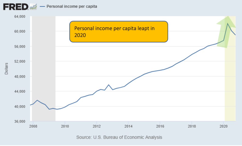
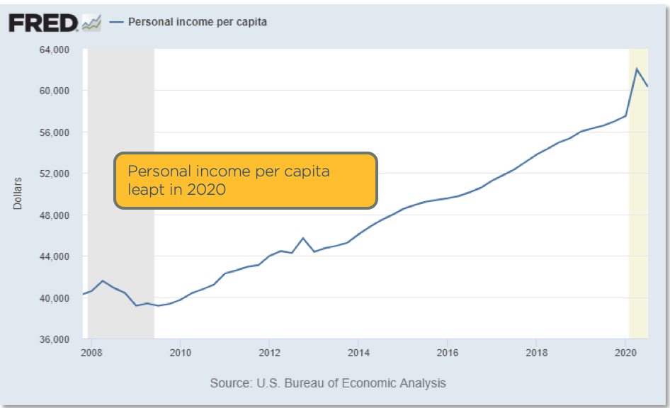
Personal Income per Capita Hit All-Time High
I’ve never seen anything like this in my decades of studying economics. You can see in 2020 there was a hocky-stick rise to a new personal income record. In looking at the underlying data, this increase is purely because of the stimulus.
While there were many, many people suffering financially from the pandemic, data shows that the US population on average is seeing record levels of income. The debt service chart below shows this from another angle.
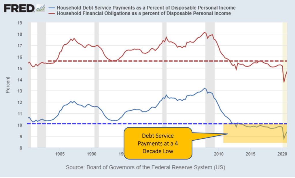
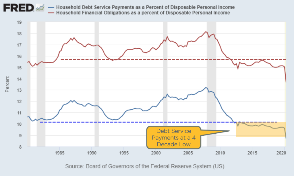
Debt Service Payments at 4-Decade Low
Look at 2020. As soon as Covid-19 hit, we see an immediately drop in debt service payments. Debt service refers to what percentage of disposable income is used toward debt payments. So, with the stimulus payments in 2020, US residents had extra cash. And because of the pandemic, they weren’t traveling or going out to eat. Instead, they paid down debt and saved money. Debt service payments are lower now than they’ve been for 30 years.
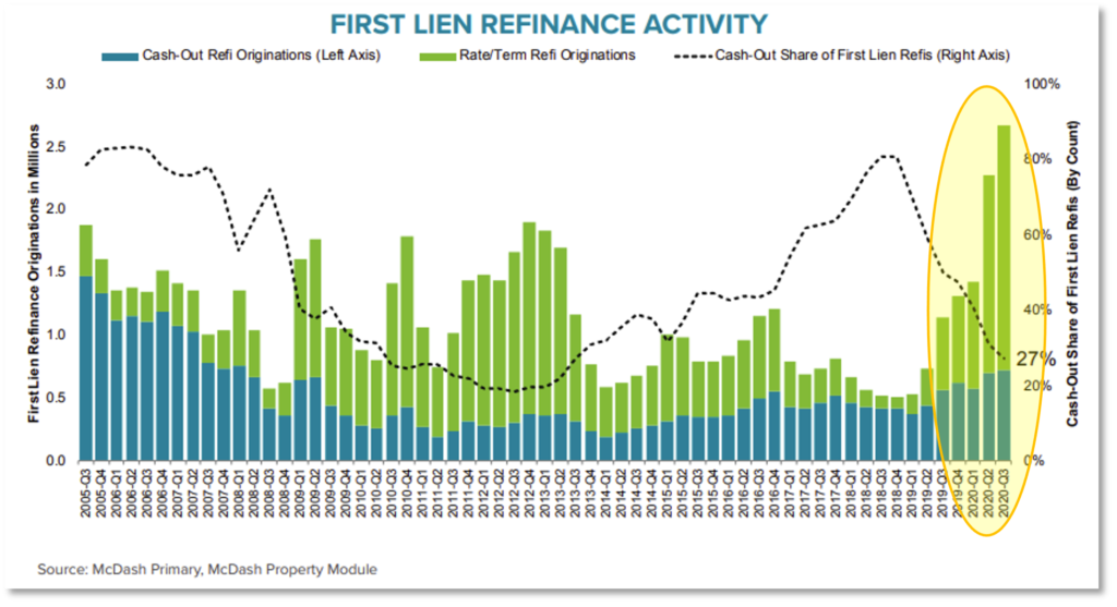
Refinances at Record-High
In this chart looking at refinances, in 2020 there was a record 9 million mortgage refinances, many of which were cash-out refinances. So not only are personal income increasing and debt payments dropping, but people are putting more and more cash into their pockets by taking out equity in their properties.
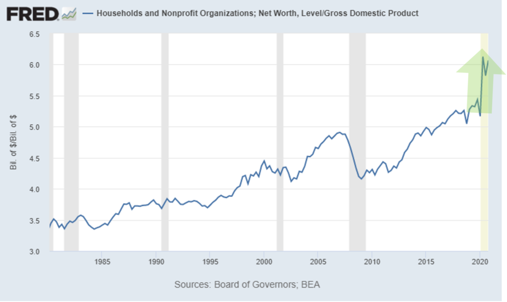
Household Net Worth at New Record
Household net worth is another metric that experienced a hockey stick-rise in 2020. The large increase is primarily due to paying off debt, gains in home prices, and gains in the stock market, all of which improves net worth.
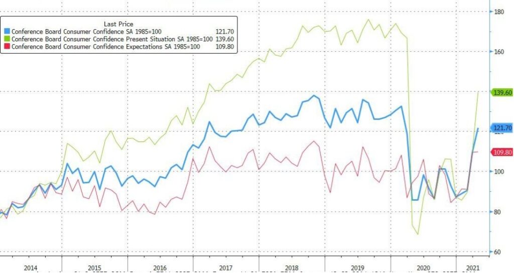
This rise in net worth produces what is called the wealth effect, where people feel like they have resources. This, in turn, creates consumer confidence. Consumer confidence has recovered back to where it was in 2017, meaning people are becoming optimistic again. This is an important metric because 70% of the US economy is driven by consumer spending. The chart below shows consumer’s confidence levels.
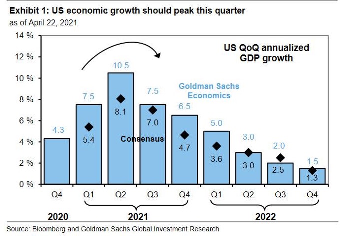
Consensus GDP
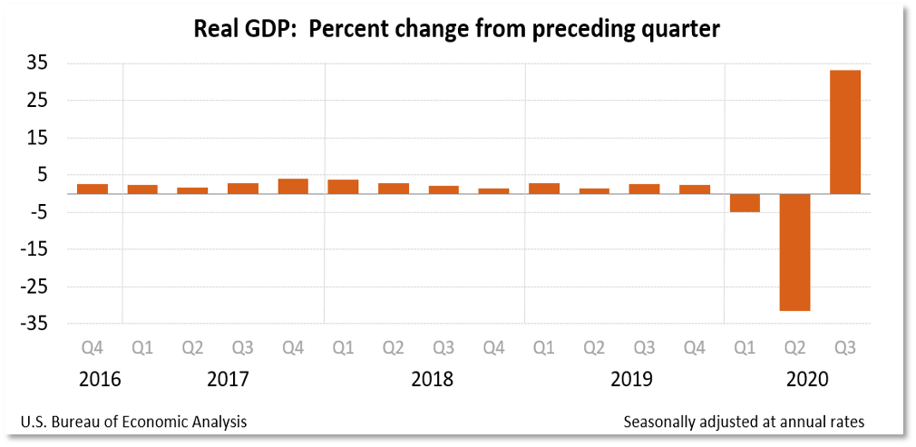
GDP growth expectations are shown in the chart below, with an expected 8.1% growth in Q2 2021 and 7.0% growth in Q3. This is based on an annualized basis, meaning they expect a fourth of that to occur each quarter. This level of growth is incredible. Normal growth for a mature economy like the US is between 2 and 4% each year.
So what’s happening now? In 2020 we had a massive dip in GDP because of the pandemic, hitting a depression-era low. Now in 2021, we’re seeing the recovery. After the big jump this quarter, it will start to taper off back to normal growth levels.
Economic Bottom Line
But my opinion is that the GDP growth will exceed everybody’s expectations. I think we’ll see blistering growth. Why? Because of a combination of all the things I mentioned: record per capita income, record savings, record net worth, record cash-out refis, record low debt service, consumer sentiment surge, and cash/profit from stimulus payments. Combine this with freedom from cabin fever as more local and international economies open to tourists, and I believe we’ll see lots of consumer spending.
Inflation
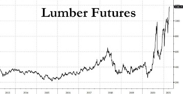
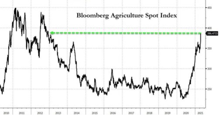
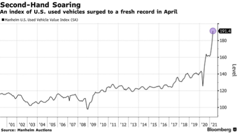
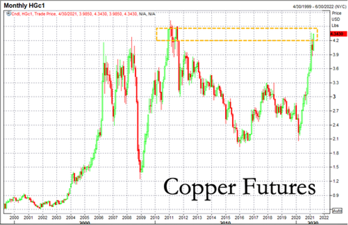
So what about inflation? Let’s take a look at lumber, agriculture, used vehicles, and copper. Copper is a very good predictor of economic growth because it is used in almost every kind of industrial application, like electronics and plumbing.
As you can see, everything is soaring. Prices are spiking, and there is a large amount of supply chain disruptions and worker shortages underlying this.
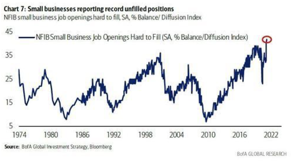
Small Businesses See Growth, Expect Pressures in 2021
A Federal Reserve Bank of Kansas City report in April showed that 70% of firms indicated selling prices are higher compared to pre-pandemic levels, mostly due to increasing materials prices. And 50% of firms reported higher new orders compared to before the pandemic. That means 50% of firms are saying their sales are higher than before the pandemic.
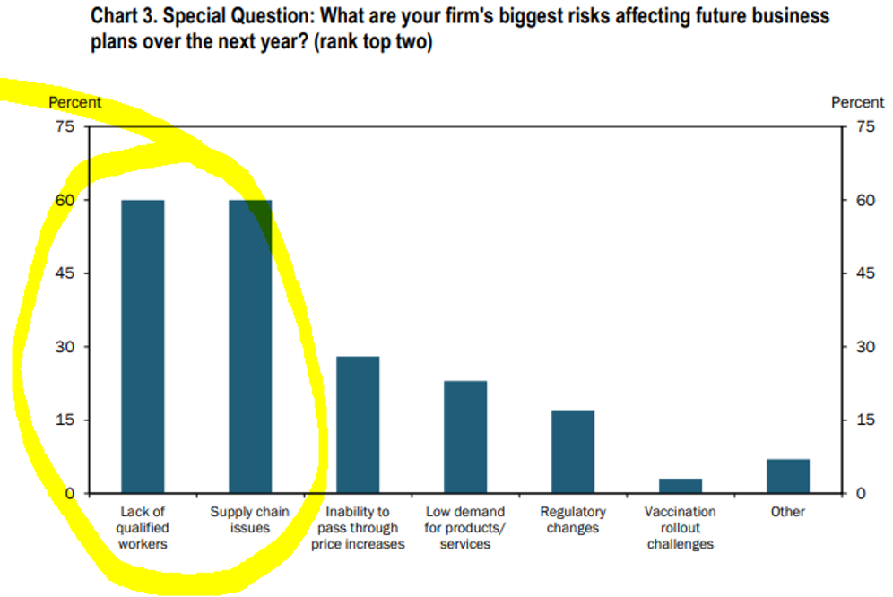
The below chart taken from that report showed that 60% of these companies consider a lack of qualified workers to be their biggest risk for future business over the next year, tied with supply chain issues.
Over half of businesses are saying they’re having trouble finding workers to fill job openings.
These comments from the Federal Reserve Bank of Kansas City report shows that stimulus measures are affecting the labor pool.
“Stimulus and increased unemployment money are wrecking the labor pool. Lower-level employees are quitting to make just as much not working.”
“Unemployed workers have no incentive to return to work given the COVID bonus payments.”
“Entry level pay will need to be increased. This will create pressure on all other positions.”
“It is very difficult to handle the increased business with supply chain issues across all materials and finding anyone who wants to work. The federal government has incentivized people to stay home and not be productive.”
“The labor shortage is driving up the price of most proteins in food manufacturing.”
“Liquidity is the BIGGEST issue. Ramp up of production is stressing cash more than usual since we depleted cash during the downturn more than what would have been typical.”
“We are facing significant supply chain problems due to COVID-19 issues, tariff issues, and the weather problems in Texas earlier his year.”
What about Interest Rates?
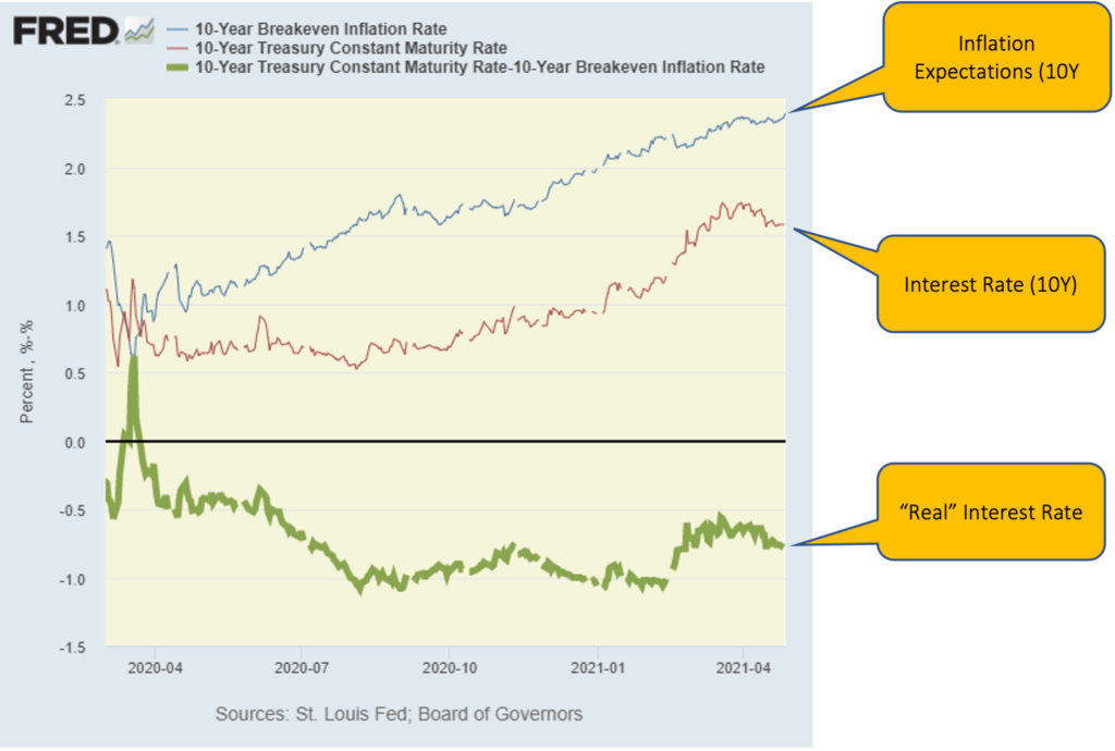
The top blue line in the chart above is the inflation expectations, called the 10-year breakeven rate. It’s basically a formula that calculates how much inflation premium is built into the price of a bond. They calculated it by measuring the difference between the yield of a nominal bond and an inflation-linked bond of the same maturity. It is essentially investors’ expectations on inflation, mathematically speaking.
The red line is the nominal interest rate, and the different between those two is the green line, or “real” interest rate, which measures what you’re actually earning on your money after adjusting for inflation. The black line being zero, you can see that real rates are still expected to be negative. During the period in the yellow box, inflation expectations stayed fairly flat, but the real rate went up. The real rate went up because investors were moving out of pandemic-era defensive bond positions. This indicatesis an expectation of a return to pre-pandemic regular economic growth, rather than an expectation of future inflation.
Will We See Inflation Coming in a Big Way?
I’ve gone into this is great depth before, but there are 4 systemic deflationary forces that are still in place today. Systemic forces means they are widespread and will not easily change. The first is wages.
Wages
Wage growth is highly capped because of automation. McKinsey projects that in the next 10 years, a third to almost a half of jobs will disappear because job hours are being automated. Think about the kiosk at McDonald’s that takes your order now instead of a person. This automation eliminates jobs and creates a downward pressure on wages.
Globalization is another wage deflator. Many US jobs can be replaced overseas for less, so essentially, every US worker competes with an overseas worker at far less money. As long as this is true, wages are capped.
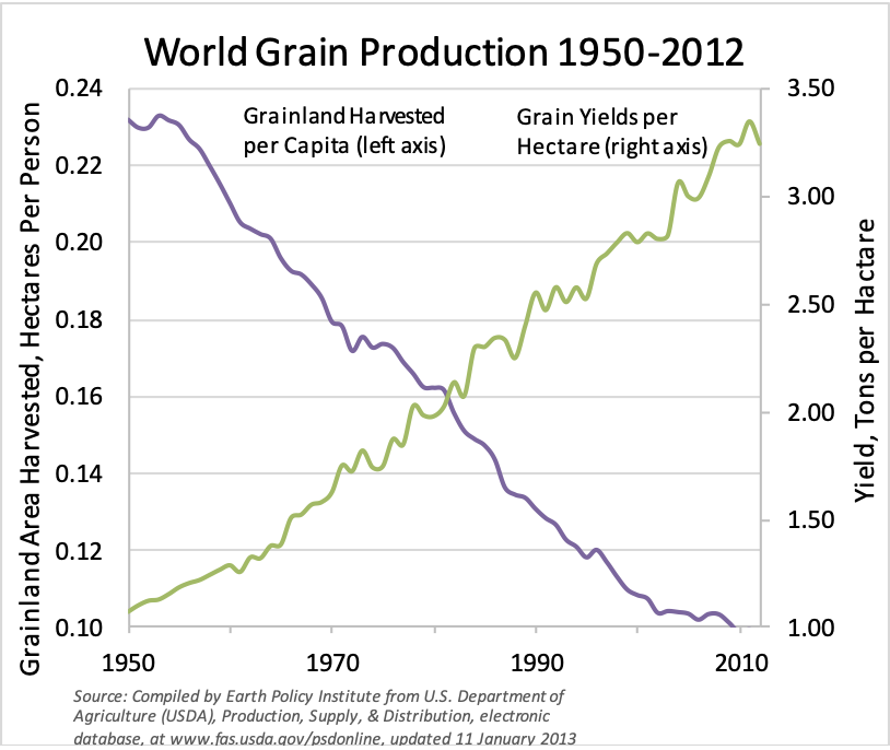
Food
This chart looks at world grain production since 1950. You can see the amount of grain land harvested drop dramatically, while the grain yields per hectare increase at the same pace.
Less and less land is producing more and more grain. This is largely the result of advances in biotechnology. Tech growth is massively improving productivity and yields, and this trend is not going to change anytime soon.
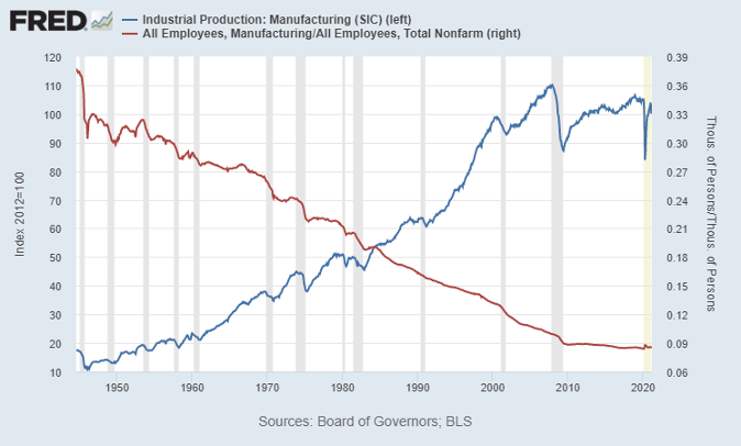
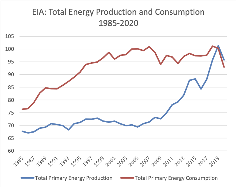
Energy
Data from the US government shows that primary energy production has risen sharply, again due to advances in technology. But if you look at consumption, it’s flattened. This is primarily due to conservation efforts like electric vehicles, renewable energy, etc. For the first time, we’ve recently seen energy production overtake consumption in America.
Energy is a long-term deflationary force because of technology advances, like fracking, for instance, that hasn’t yet been deployed in other high-energy-producing countries like Russia, Siberia and Saudi Arabia. The higher oil runs in price, the more producers will be incentivized to deploy these new technologies. This will cap prices.
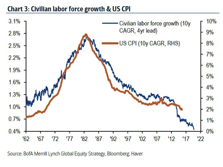
Demographics
An aging population and declining labor force growth rate acts as another cap on inflation rates. Inflation is highly correlated to the age of the workforce, as you can see from the chart below showing the consumer price index (CPI) and labor force growth rates. As the workforce ages and retires, they are not contributing to GDP anymore and consumer prices stay steady.
These are big inflationary components that are in a systemic deflationary cycle. The one anomaly is housing, which makes up about one third of the CPI. Housing is a large inflationary component, and it does continue to grow, but I believe that generally inflation will not be as big a problem as many are thinking because of these dramatic, long-term deflationary forces in place.
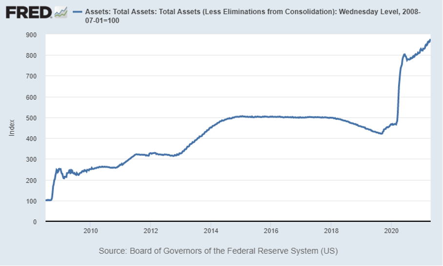
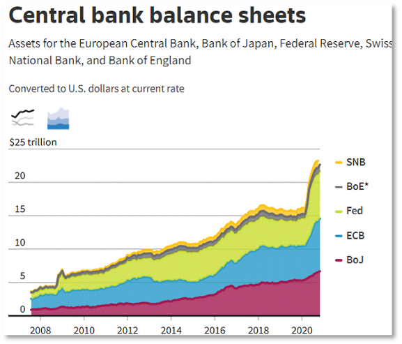
What about the Fed printing money?
The chart below is a snapshot of the Federal Reserves’ total assets over the last 10 years, the period of greatest monetary expansion in history.
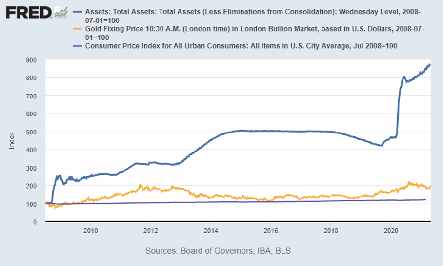
The sharp inclines are when the Fed prints more money, which has increased steadily over the last 10 years. But take a look at the same chart with gold, CPI, and inflation included.
Asset prices rose, but the real economy did not. Inflation did not hit consumer prices, but it did raiseasset prices. All the liquidity that the Fed printed does not go into buying more consumer goods, but rather into buying assets.
Now, that may shift a little bit with the new stimulus package methodology of direct-to-consumer. Historically, government stimulus measures were in the form of tax breaks (for corporations among other things), and you would see a trickle down to the end consumer. But in this case, a consumer with $1,000 in his pocket, may go to the Apple store and spend it.
Basically, I believe we will see increasing inflation primarily due to supply and demand shortages because of supply chain change, disruptions, and labor shortages. But I expect that inflation pressure to ease in 6-9 months as supply chain disruptions are solved and expanded unemployment benefits end. So, workers get back to work and supply chain kinks are worked out.
Inflation Bottom Line
We will see increasing inflation primarily due to increased demand and supply shortages (supply chain disruptions and labor shortages) in the short term
We expect to see inflation pressures ease as supply chain disruptions are solved and expanded unemployment benefits end
Mr. Fraser has 20+ years’ experience as a finance and technology executive and is a former E&Y Entrepreneur of the Year Award winner. In 2012 Fraser co-founded Aspen Funds, a fund management company focused on mortgage investments. Fraser is responsible for financial management, portfolio modeling, as well as systems and processes, designing and deploying Aspen’s scalable state-of-the-art back-end platform.
Join Our Mailing List
Get the latest in investing advice, industry news and updates on our current and new offerings
In part 1 of the summer 2021 economic update, we covered inflation and whether it’s something to be worried about. Part 2 will cover real estate and where the housing market is headed.
Current Real Estate Market Overview
Home Prices
It likely comes as no surprise that home sales are absolutely booming, hitting the highest point in 15 years.
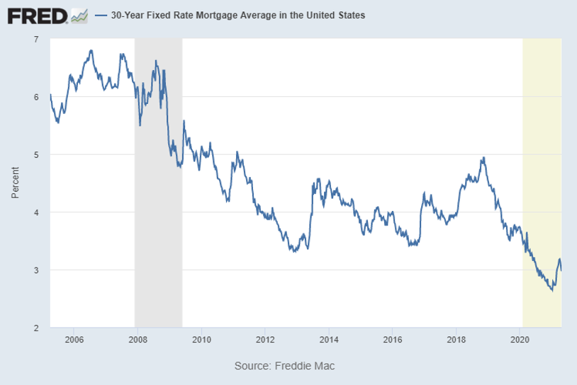
This is in large part due to very low fixed mortgage rates, which you can see in the chart below are some of the lowest we’ve seen in recent years.
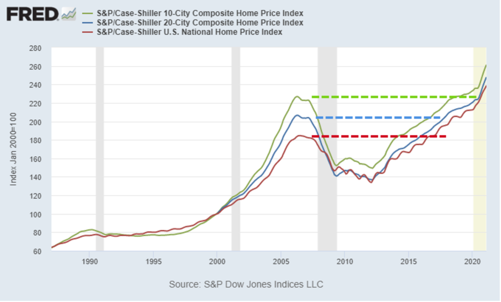
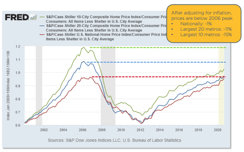
If you break housing down by metros, prices are on the rise and are now above the 2006 peak across all metros. Take a look at the chart below. The green trend line is the largest 10 cities in America, the blue line is the largest 20 cities, and the red line is the national average. For all 3 indexes, there was a sharp increase end of last year on top of an already aggressive climb upward.
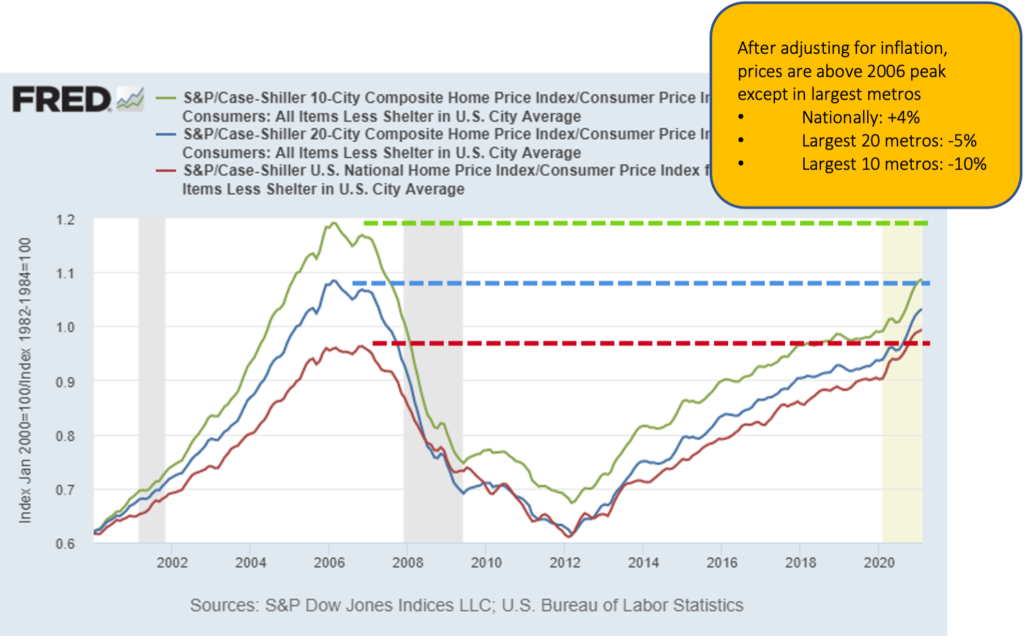
After the 2008 crisis, the national average for home prices recovered ahead of the largest cities’ prices, but now are all well above previous peaks. Some might be concerned looking at the prices and seeing how far past the previous peak we are. But take a look at the chart below where I’ve adjusted the trends for inflation.
When you adjust for inflation, both the largest 10 and largest 20 metros, are actually still well below their previous peaks. Inflation has been steadily increasing over the last 15 years and home prices are still catching up. Nationally, we have just surpassed the previous peak for the first time.
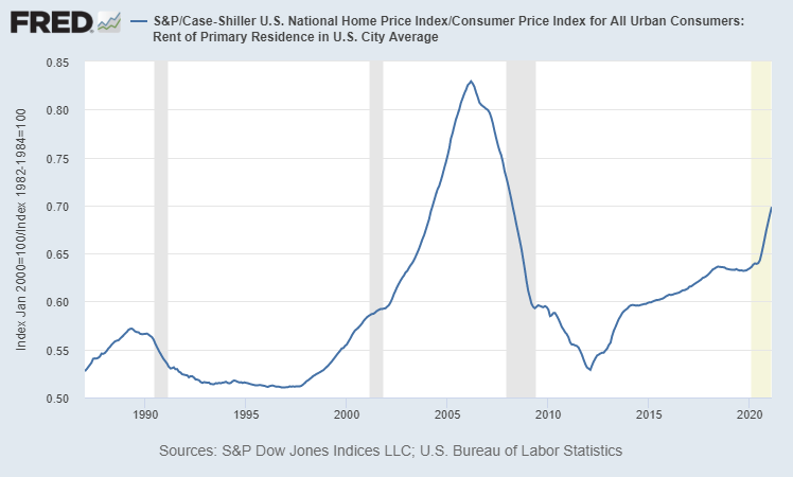
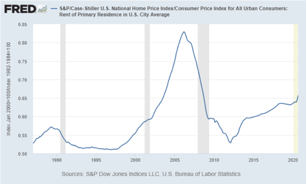
Though prices are rising, it’s still cheaper to buy a home than to rent in terms of monthly payments. See the chart below.
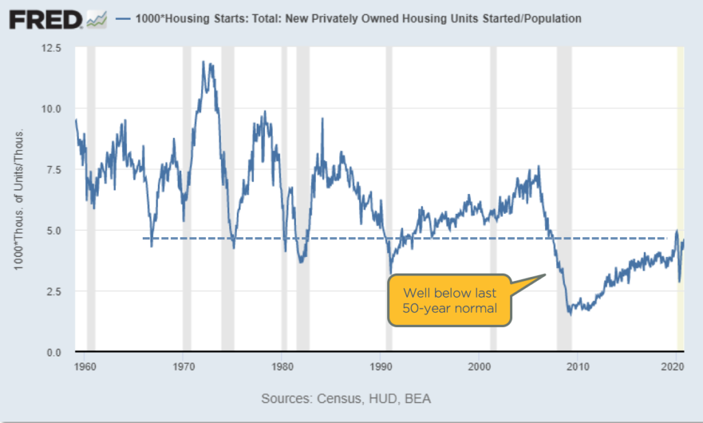
This is due in part to an acute housing supply squeeze, causing more people to continue renting. There is a massive shortage of houses available for purchase, as they’ve been underbuilt for the last 15 years.
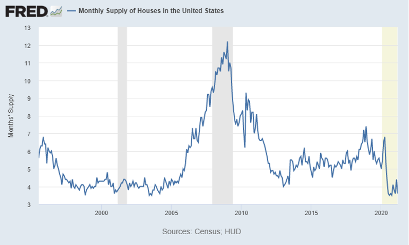
Supply Shortage
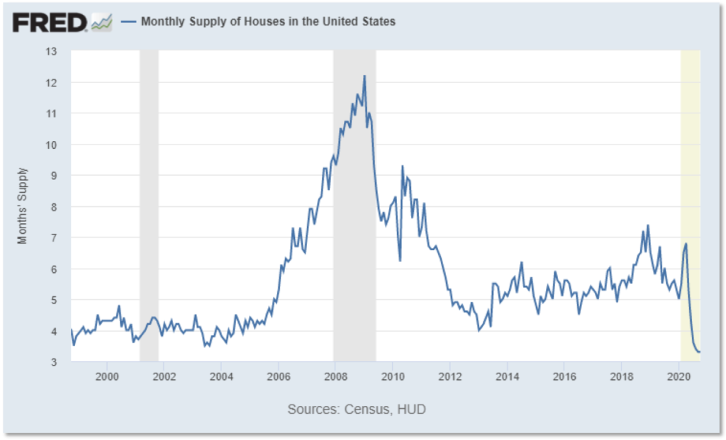
With the current acute housing supply squeeze, we only have a 3.6 months’ supply of homes available, one of the lowest amounts in the last 25 years.
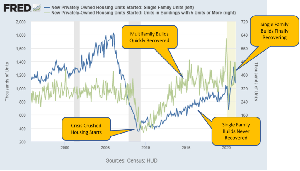
This housing shortage is primarily due to housing being underbuilt for the last 15 years.
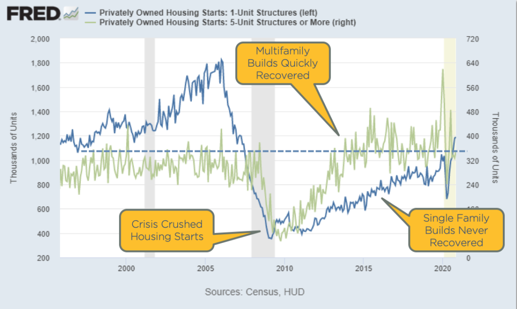
In the great financial crisis in 2008, new single-family construction came to a halt, as you can see from the blue line in the chart above. New multi-family construction, the green line, also dropped, but has since recovered to above pre-2008 levels. Single-family construction, however, has only recently recovered to historical levels.
So why aren’t more houses being built?
Back before the financial crisis, you could buy a plot of land, build a house on it, and sell it for profit. But now if you did that, you may not make money. Why? Because of inflation. Inflation has continued to climb over the last 15 years, and the cost of land, labor and materials has grown significantly. And as we saw in an earlier chart, house prices have not kept pace with inflation, meaning new single-family home builds have generally not been profitable.
But we can also see that single-family construction is starting to pick back up and enter into a normal range. As that blue line continues to tick upwards over the next couple of years, we’ll see a new supply of homes being built that will actually start to normalize the market and take the pressure off.
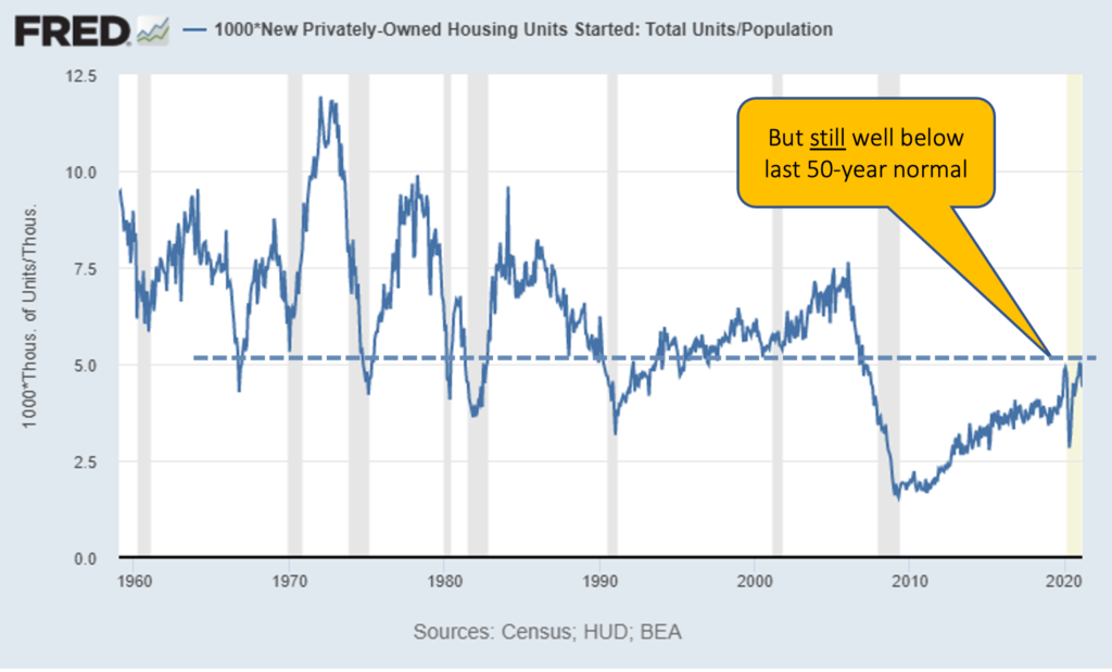
Chronic Shortage Relative to Population
Taking the data of single-family builds and adjusting it relative to population shows a chronic shortage. During the 15 years since the crisis when no new homes were being built, population kept growing, continuing to widen supply gap.
Demand continues to climb as the population increases. Once the number of builds starts to normalize and catch up on this shortage, I’ll call a top to the housing market, but we’re still not that close to that point.
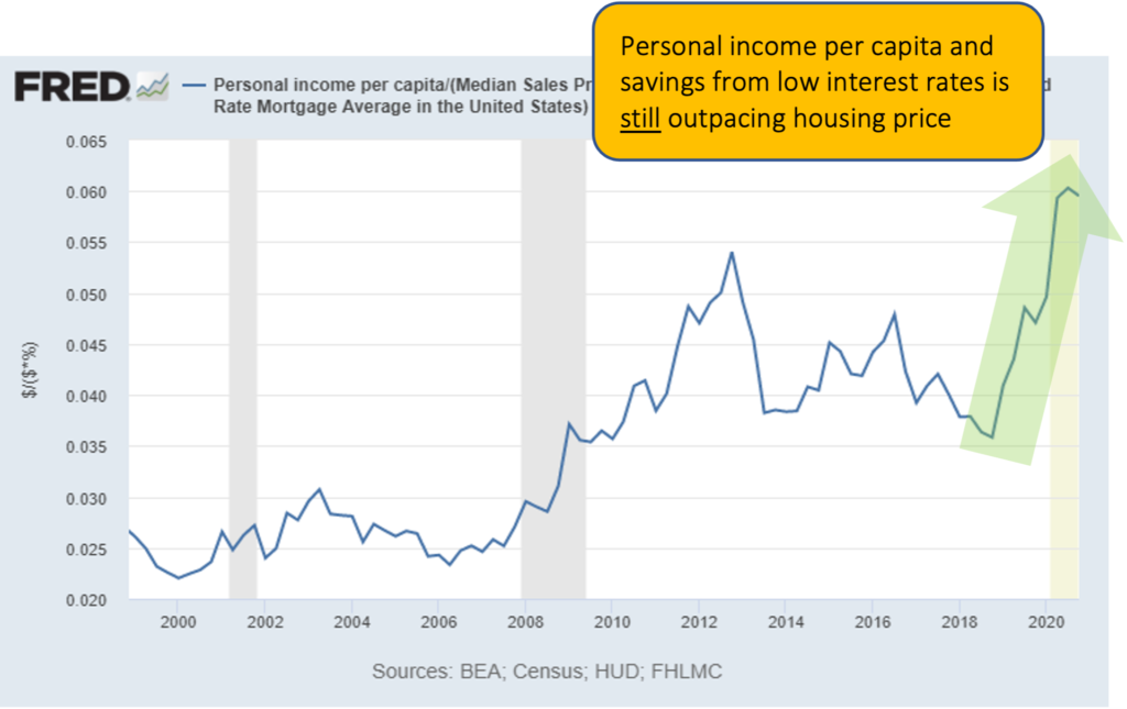
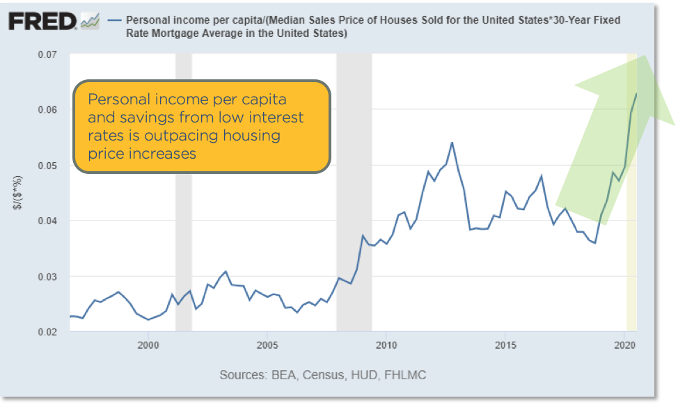
This also speaks to housing affordability. Even with higher home prices, the rising income per capita and higher savings from low interest rates are still out-pacing housing price growth. It’s still affordable to buy homes relative to income.
So are we in a bubble?
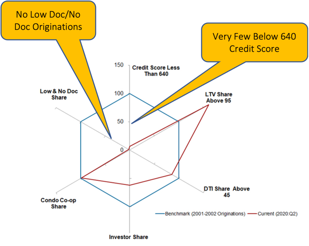
Mortgage Loans Then vs Now
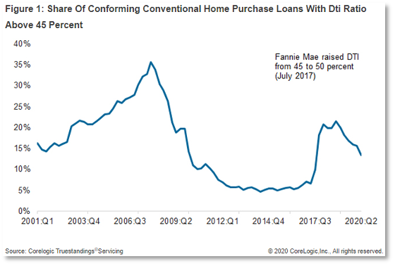
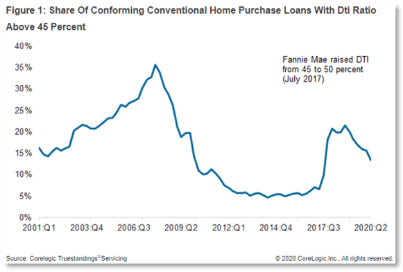
Because there is real, pent-up demand for housing after a 15-year shortage, we are not in a housing bubble. Take a look at this data from CoreLogic showing the differences in home loans from the early 2000s compared to now.
The line shows the percent of home loans where the debt-to-income (DTI) ratio is above 45%, meaning where almost half (or more) of a person’s income is going towards paying for the roof over their head. In 2006, that was over a third of the loans. To a banker, the lower this number the better, as it means the mortgage is more affordable relative to their income.
Right now, we’re not even close to that. DTIs are very conservative.
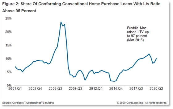
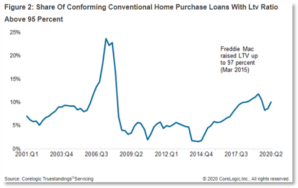
The chart below looks at loan-to-value (LTV) ratios above 95%, meaning a buyer has only 5% equity in a home and the rest of the purchase price is supplied by a loan. In 2006, more than 20% of homes were purchased with an LTV over 95%. Today, we’re less than half of that.
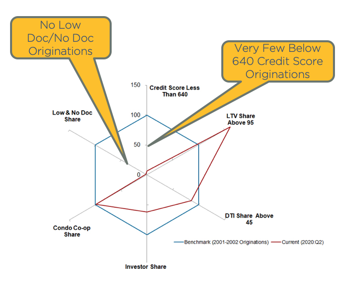
And take a look at this chart showing the percent of mortgages that were low doc/no doc loans. A loan of this type is basically one where there is little or no income verification. A buyer could simply state how much they earned and no one would double check.
These low doc/no doc loans that were so popular in 2006 during the housing bubble are almost non-existent now. Same with loans for buyers with credit scores below 640, another large share of loans originated in the mid-2000s. The underwriting on mortgages now is much more conservative.
Real Estate Bottom Line
Homes – Record Strength to Continue
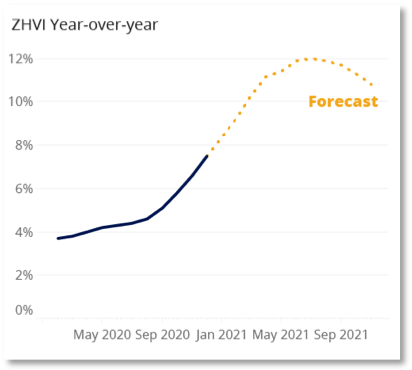
Corelogic forecasting +1.9% growth in 2021
Zillow forecasting 10-12%
Our estimate: growth will be at or above 2020 levels: 8-10% growth in 2021
Few new homes being built
Low housing supply: 3.6 months
Low Interest Rates
High Affordability
Low Price to Rent Ratios
CRE Multifamily and Office – Global interest rate compression will keep cap rates low
Office demand will significantly soften as work-from-home becomes permanent for many. But since most office space is on long-term leases, impact will not be immediate or acute
Retail & Lodging – Huge opportunity in distressed properties
Mr. Fraser has 20+ years’ experience as a finance and technology executive and is a former E&Y Entrepreneur of the Year Award winner. In 2012 Fraser co-founded Aspen Funds, a fund management company focused on mortgage investments. Fraser is responsible for financial management, portfolio modeling, as well as systems and processes, designing and deploying Aspen’s scalable state-of-the-art back-end platform.
Join Our Mailing List
Get the latest in investing advice, industry news and updates on our current and new offerings
The 6th and final part of this series on the economy in 2021 takes a look at Aspen Funds. This part covers the fund strategies, performance throughout 2020 and the COVID crisis, and positioning moving into next year.
See below for parts 1-5 of this economic series.
Aspen RPN Strategy – Income Fund
In our re-performing notes (RPN) strategy used by our Income Fund, we buy discounted first and second liens and hold for income and cap gains.
The notes in this strategy are called re-performing because at one point the borrower was not making their payments, and then they began making the payments again. This doesn’t mean there is anything wrong with the home, only that the borrower had trouble. But we find that typically borrowers recover. Because these loans are re-performing, we are able to buy them at a discount.
So in essence, we buy notes on single family residences and we hold them, receiving the mortgage payments and capital gains. Because we buy these mortgages at a discounted rate, when a note is refinanced or a home is sold, we recover that discount and make money.
This strategy is very well positioned for 2021 and what’s on the horizon. As we looked at in the housing market portion of this forecast, increasing home values flow through to our equity. This has been the case for the last 8 years. Additionally, low mortgage rates encourage refinancing. Our fund benefits when we get refinanced out of a loan, because our note gets paid off and we recover any discount in that loan that we received from a discounted purchase price. In our estimation, 2021 will be a good year for this strategy.
Portfolio Details
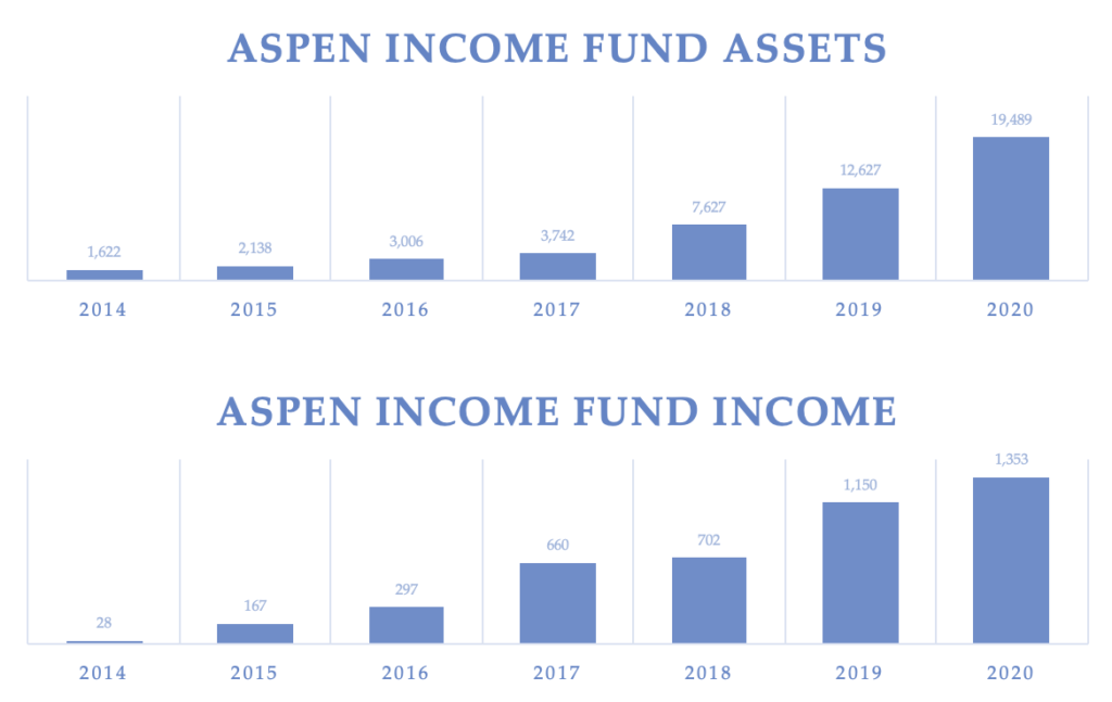
We have an 8-year track record operating in this strategy today. Our fund has about 500 loans in its portfolio across the United States.
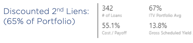
Second Liens
About 65% of our portfolio is discounted second liens, about 342 loans.
In many cases we prefer to buy a second lien over a first lien. Here’s an example to explain why. Let’s say there’s a $300,000 house, with a $100,000 first lien, and a $100,000 second lien. You could buy that first lien without a discount on it, and it would be at a 4% interest rate. You’d earn 4% on that loan.
But let’s say I could buy the $100,000 second lien, which is a lower priority than the first. But it has an 8% interest rate, and I can buy it at a discount of 50 cents on the dollar. So my return doubles and I’m actually earning 16% on that loan. If I buy it at 50 cents on the dollar, then I only pay $50,000 for that $100,000 note. And so when it pays off, I actually have a capital gain of $50,000 in addition to the interest collected from monthly payments. So in many cases, the second liens are far superior and we prefer to own those in our portfolio.
So with the 342 second liens that make up this portion of our portfolio, on average we own the notes at 55 cents on the dollar. That means we have paid $55,000 for a $100,000 loan.
These loans are fairly safe with an average 67% ITV, meaning the liens on these homes (at our cost) are only two-thirds of the value of that home. So there is 33% in equity in the value of the home above us.
Our scheduled yield is 13.8%, assuming that all mortgage payments are made on time. That’s the contractual yield on that after the discount.
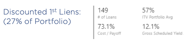
First Liens
We also own 149 first liens, which make up 27% of our Income Fund portfolio. On average, we bought them at 73 cents on the dollar, a 27% discount from the face value.
These loans are even safer with a 57% average investment to value ratio. So these loans have very deep equity and very little risk. We have a 12% gross scheduled yield on those loans.
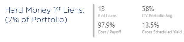
Hard Money Loans
The third and final part of our portfolio is hard money loans. These make up 7% of our portfolio with 13 loans.
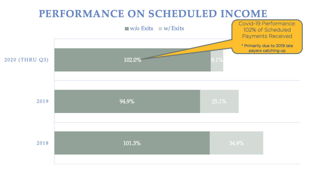
COVID-19 Resilient
Our Income Fund has proven to be COVID-19 resilient. The below chart shows our performance on scheduled income, as the contractual payments that we expected to receive if everyone paid on time. In 2020 through Q3, we’ve received 102% of contractual payments. This is more than what we expected primarily due to those with late payments in 2019 catching up. In December 2019, a fraction of people were late and that rolls into the next year. The bottom line is we’ve proven to be fairly COVID-19 resilient, and with the economy likely turning early in the first half of 2021, we’re very optimistic about the performance of this fund.
Below are our basic financials for the Income Fund over the last seven years of operating the strategy, including our assets and income. This fund has a strong operating history and a healthy outlook for 2021 in our opinion.
Aspen NPN Strategy – Growth Fund
Our second strategy is our non-performing note (NPN) strategy, used by our Growth Fund. In this strategy we buy discounted, residential non-performing second liens, where the senior lien is performing. These homes are typically owner occupied. So with this strategy, we’re buying a second lien that’s not being paid where the first lien is being paid, and we fix this loan.
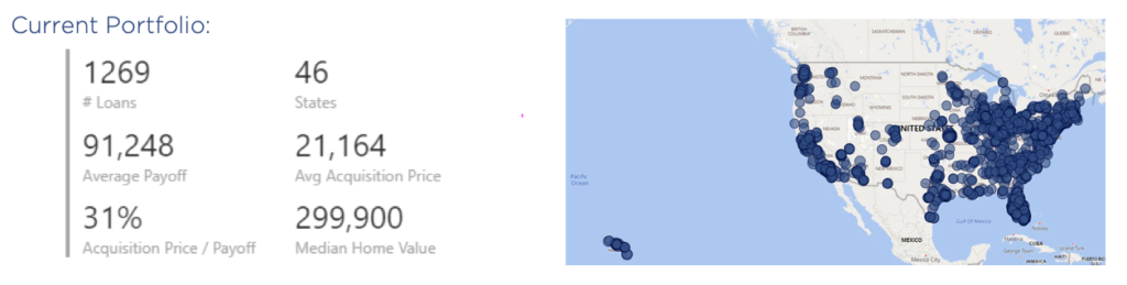
Our strategy here is to buy these loans at a discount and to execute one of seven exit strategies. Our current portfolio is spread across four growth funds, 1,269 loans in 46 states all over the United States. Our average payoff is $91,000, and our average acquisition price is $21,000. So we basically pay, on average, 31 cents on the dollar. Our median home value is $300,000.
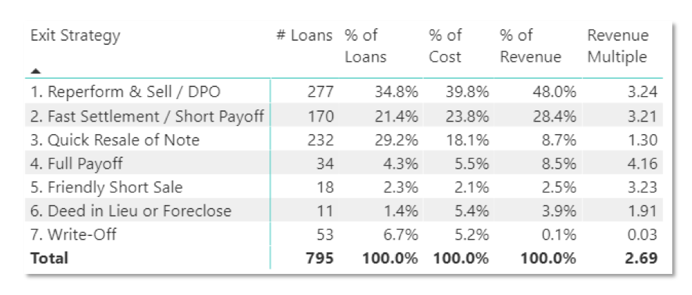
In our NPN Strategy, we have seven exit strategies.
We have had 795 exits over the last 8 years across four operating funds. Our most common exit strategy is to modify the loan. We talk with a borrower, come up with a payment plan that they can afford, and we re-perform that loan. Once we modify the loan and get it performing again, we sell the note. We’ve done this with about 35% of our loans, generating about 48% of our revenues. This turns into a revenue multiple of 3.24X.
Our second largest exit is a fast settlement / short payoff. In this strategy, we may have a $25,000 note and we’ll settle for $15,000 with the borrower, wiping out their debt and fixing their credit. We’ve done this with about 21% of our loans, generating 28% of our revenues. This turns into a revenue multiple of 3.2X.
Overall, our average return across all 7 exit strategies is a 2.69X multiple over the last 8 years.
This NPN strategy is very well positioned to benefit from 2021 economic trends, primarily due to increasing home values. These home values flow through to our equity, and we find borrowers are more willing to work with us to position themselves to capture home equity growth. If a homeowner knows that their home value has been going up 5% per year, with likely more to come, they’re more likely to want to capture that equity and build their own wealth, rather than let it all go away to a non-performing debt.
Borrowers’ capacity is increasing due to personal income and savings rate increasing, and the COVID-19 crisis will undoubtedly generate a new wave of NPN notes available for purchase, perhaps in the beginning of 2021. Both of our strategies are poised to benefit from the current economic situation.
Recap
Up to this point, we’ve covered what happened economically in 2020, where we believe the economy is headed in 2021, how Biden’s proposed tax plan with impact the economy, where the housing and stock markets are headed, and how Aspen’s funds are positioned moving into 2021.
Mr. Fraser has 20+ years’ experience as a finance and technology executive and is a former E&Y Entrepreneur of the Year Award winner. In 2012 Fraser co-founded Aspen Funds, a fund management company focused on mortgage investments. Fraser is responsible for financial management, portfolio modeling, as well as systems and processes, designing and deploying Aspen’s scalable state-of-the-art back-end platform.
Join Our Mailing List
Get the latest in investing advice, industry news and updates on our current and new offerings
Part 5 of our series on 2021 economic predictions covers the stock market. Topics include the business valuations in the S&P 500, P/E ratios and subsequent historical and projected earnings, and our predictions of who will be the 2021 winners.
S&P 500 Overweights Tech Giants – And Their P/E Ratios are Insanely High
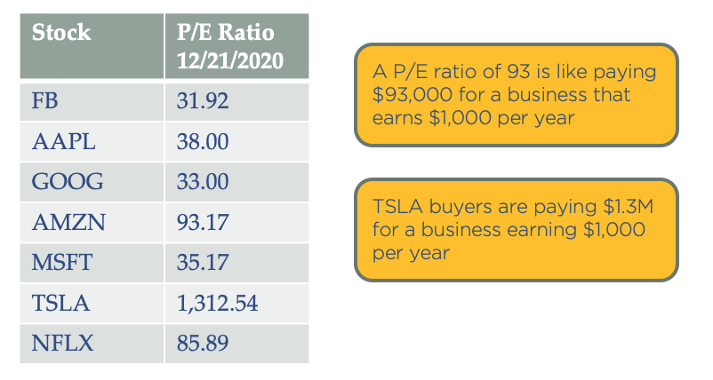
When people go to invest in the stock market, it’s very popular to simply invest in an index like the S&P 500. But a very important element to know is that all the indices like the S&P 500 are overweighting a few tech giants, and their PE ratios are extremely high.
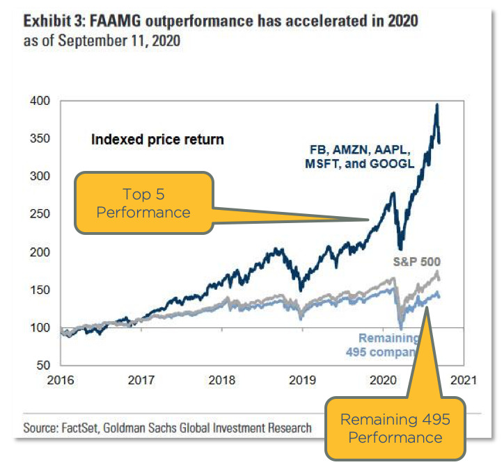
The dark blue line in the chart below shows the top five companies in the S&P 500: Facebook, Amazon, Apple, Microsoft, and Google. You can see how much they are affecting the S&P 500. And you can see the other 495 stocks down below with the light blue line. The tech guys are on fire.
P/E Ratios of The Tech Giants
What is a P/E ratio? P/E ratio is the price per share divided by the earnings per share. Essentially, it’s how much you’re paying for a stock relative to its earnings. Here’s an example. Amazon is at a 93 P/E ratio. That is like paying $93,000 for a business that earns $1,000 per year. That’s in essence what you’re doing if you’re buying a share of Amazon stock. These tech giants are very pricey on any basis you evaluate.
Tesla, which was just added to the index, is actually just above a 1300 P/E. Following our same example, when buying Tesla shares, you are essentially paying $1.3 million for a business that’s earning $1,000 a year. It sounds extreme; would you pay that much for a business with $1,000 in earnings? Well, the answer is yes if it’s Tesla. So clearly the valuations are just insane right now.
Valuation is the Bigger Issue
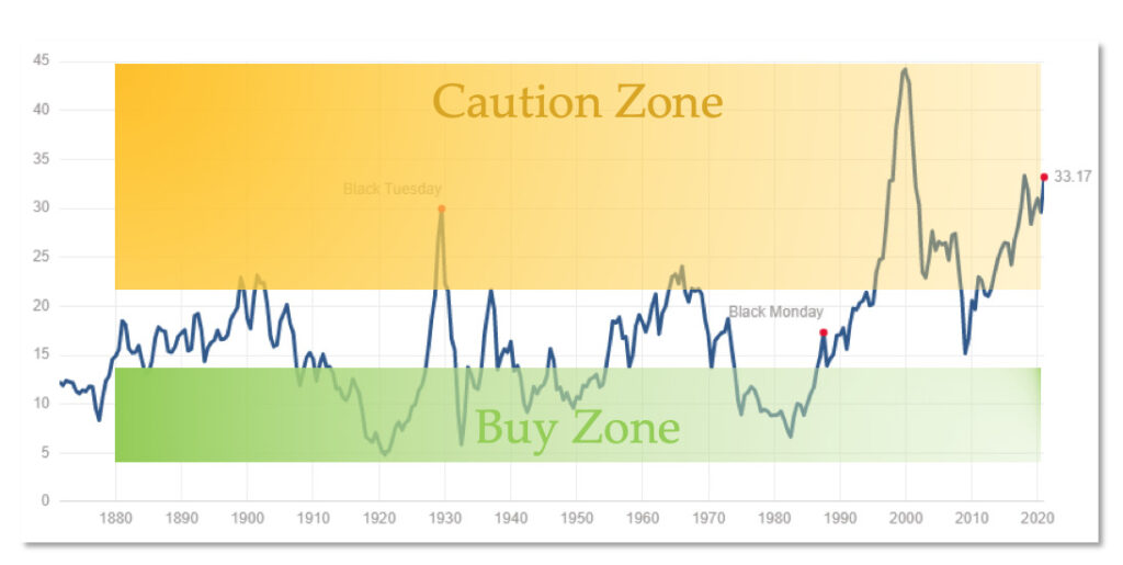
The total stock market price to earnings ratio is at 33, which means on average, investors are paying $33,000 for $1,000 of earnings. The entire reason for buying a business is to earn money, so this is definitely a caution zone.
You can see previous peaks in 1929 and the 2000 dotcom bubble. We’re currently higher than a lot of people are comfortable with. Why does it matter? Well, it makes sense that the more you pay for something, the less likely you’re going to profit from it when you sell it, right? The bottom line is price to earnings ratio matters. You want to buy when stocks are cheap and sell when they’re high, not buy when they’re expensive.
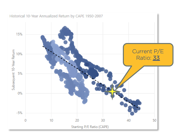
This is a scatterplot chart, and each dot is one month in history since 1950. The chart plots the P/E ratio at that time along the X axis, and shows historical returns annualized over the following 10-years. So had you bought on January 1st of 2000 at a 40 P/E ratio, your returns over the next 10 years were -5%. This is historical fact. Had you bought the stock market at that point and at that 40 P/E, you would have lost 5% per year over the next 10 years.
You can see, this is not a random chart, but there is actually a correlation between P/E ratio and future gains. So contrary to what modern portfolio theory asserts, that one should always be in the stock market, it matters what time you are in the stock market. History shows that valuation and timing greatly affect returns. You can time the stock market, and it’s best to invest when the stock market is cheap.
So where are we now? Well, at a 33 P/E, that puts us where the star is, right on the trend line. You can see right there that we’ll likely see returns in the -1% to 5% range over the next 10 years if history is any indication of the future. So, not great. The P/E ratio has been a very good predictor of future stock market returns.
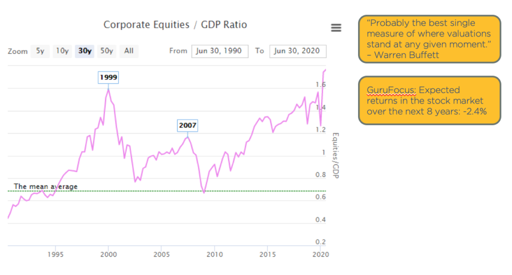
The “Buffett Indicator” – Total Stock Market Value / GDP
The “Buffett Indicator” is what Warren Buffett claims is the best single measure of where valuations stand at any moment. Buffett is the most successful investor of all time. He started with very little and has created billions of dollars in wealth. He has said that what he looks at is the total stock market value relative to the size of the economy. If the stock market is valued more than the entire economy, it’s probably overpriced since it derives its value from the economy. And if it’s a fraction of the economy, then it’s probably a good price. And so you can see in 1999, it was not a good time to invest in the stock market. You would have had some losses.
The green line in the above graph is the mean, the long-term average. This chart only goes back to 1990, but you can see we’re at a record high. So again, it shows the stock market is high.
A quick note, why is the stock market so high? This is the result of liquidity and of the massive stimulus programs. Some of that liquidity flows into the stock market. As an example, if you could borrow $1 billion at a 1% interest rate, what would you do with it? Well, you might buy stocks, and then stocks go up. And not based on value necessarily, but based on the fact that you think someone else is going to pay a higher price than you will pay, regardless of what the actual earnings are.
Crashes & Drawdowns
One of the things that is underestimated in the stock market is the risk versus reward. It always amazes me that financial advisors tell people to be in the “safe” investment of the stock market versus alternative investments, which is our space. Many alternative investments do not have nearly the volatility of the stock market.
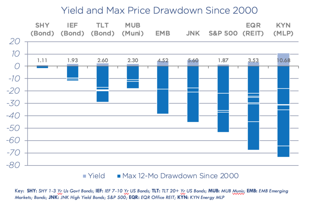
Let’s look at the historical data since 2000. The above chart shows the yield and max price drawdowns of many popular investment stocks. With KYN, there have been 6 drawdowns of 20% or more, some as high as 70%. This means one morning you could have woken up and lost 70% of your investment. There have been 6 of these just since 2000. With EQR, which is an office REIT, there have been 7 drawdowns of 20% or more.
These drawdowns are significant. In order to get a 3% yield, investors take a 60-70% risk. And it’s the same in the S&P 500. In the stock market, people are stretching for income unaware of the volatility risk.
Why Volatility Matters
Without volatility, we can see the magic of compounding. It was Einstein who said, “compound interest is the 8th wonder of the world.”
Let’s take a look at a couple scenarios.
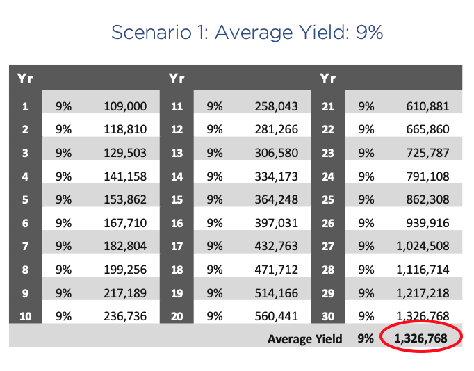
Scenario 1. You invest $100,000 and hold it for 30 years, and your average yield is a consistent 9%. At the end of 30 years at 9% growth, you have $1.3 million. That’s the power of compounding.
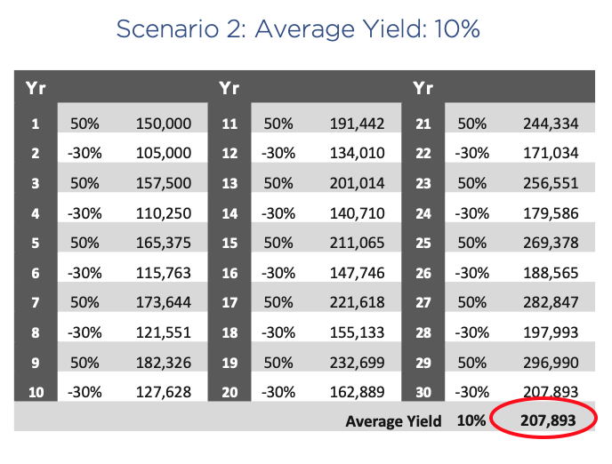
But here’s a comparative scenario. Scenario 2. You again invest $100,000 over 30 years, and your average yield is 10%. But in this case, you gain 50% one year, lose 30% the next year, and so on, but your average is still 10%. At the end of 30 years, you end up with just over $200,000, a fraction of what you earned with a consistent 9%.
Volatility is the destruction of compounded returns. People should avoid volatility wherever possible.
Bottom Line – Where the Stock Market is Headed in 2021
We will see a continued upward climb, but with volatility.
Stocks will benefit from a global stimulus. When new money is printed, asset prices rise. Anything that can’t be printed goes up in value, including stocks, real estate, gold, Bitcoin, etc
Valuations are generally unattractive
Indexes are increasingly plagued by concentration risk,
All these factors increase volatility
The outsize opportunities in my opinion for 2021 are:
REITs with lodging and retail exposure. Currently, some are down as much as 90%.
Regional banks. Again some are down 70 to 80% still, and they have not yet participated in the big gains, so they’re laggards.
Entertainment shares like movie theaters, IMAX, etc.
And also energy has been pummeled. Although I think caution is in order because oil prices are capped by untapped production and technology. The largest oil producer in the world is the United States, and it’s due to technology. And since this technology has not even been deployed in other oil producers like Siberia, Russia, and Saudi Arabia, oil prices are capped. As soon as prices rise, you’re going to see production increase and flood the market. So I’m not very excited about energy in general, but there will be some outsize opportunities in the 2020 laggards.
Recap & Next Article
Up to this point, we’ve covered what happened economically in 2020, where we believe the economy is headed in 2021, how Biden’s proposed tax plan with impact the economy, and where the housing and stock markets are headed.
Mr. Fraser has 20+ years’ experience as a finance and technology executive and is a former E&Y Entrepreneur of the Year Award winner. In 2012 Fraser co-founded Aspen Funds, a fund management company focused on mortgage investments. Fraser is responsible for financial management, portfolio modeling, as well as systems and processes, designing and deploying Aspen’s scalable state-of-the-art back-end platform.
Join Our Mailing List
Get the latest in investing advice, industry news and updates on our current and new offerings
Part 4 of our series on economic predictions in 2021 will cover real estate, including trends in urban flight, single family housing, mortgage delinquencies, housing prices, and details on whether or not there’s a housing bubble.
Economic Tides vs Waves
One of the things I realized decades ago, was that when the tides come in, all boats float. Even boats that have holes in them, boats that are not that great, all boats float. So if you invest in the wrong house, but you did it the right time, you’re still going to make money. And on the other side of the coin, if you invested in the right house at the wrong time, you’re still going to lose money. So when the tides go out, it doesn’t matter how good your boat is, it’s going down. This is why we focus on really understanding economic tides, what the major forces are driving value and asset prices in our day. So let’s dive in here and take a look at the real estate market.
Trends in the Housing Market
Urban Flight
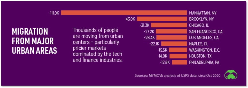
One new trend we’re seeing is urban flight. People are moving from urban centers, especially in pricier markets. According to MYMOVE, in 2020 111,000 people have exited Manhattan. Another 43,000 have left San Francisco. We’re seeing an exodus from higher cost urban areas, with many people thinking that if they can work from home, why not move? Why work in a crowded, expensive, low-quality-of-life area, when they can live somewhere else that may be more appealing.
Most People Made Full or Partial Rent Payments in 2020
According to the National Multifamily Housing Council, when it came to apartment rents, 76.4% of households made full or partial payments in September 2020, versus 82% a year ago. So we’re definitely seeing some pressure on renters, but it’s not extreme yet. The direct stimulus payments, unemployment checks, and the PPP programs all aided renters.
Where Are Housing Prices Headed in 2021?
Another amazing trend, and something that we have been tracking and forecasting for years, is a super strong single family housing market. We’re continuing an eight year trend of 5%+ year-over-year growth.
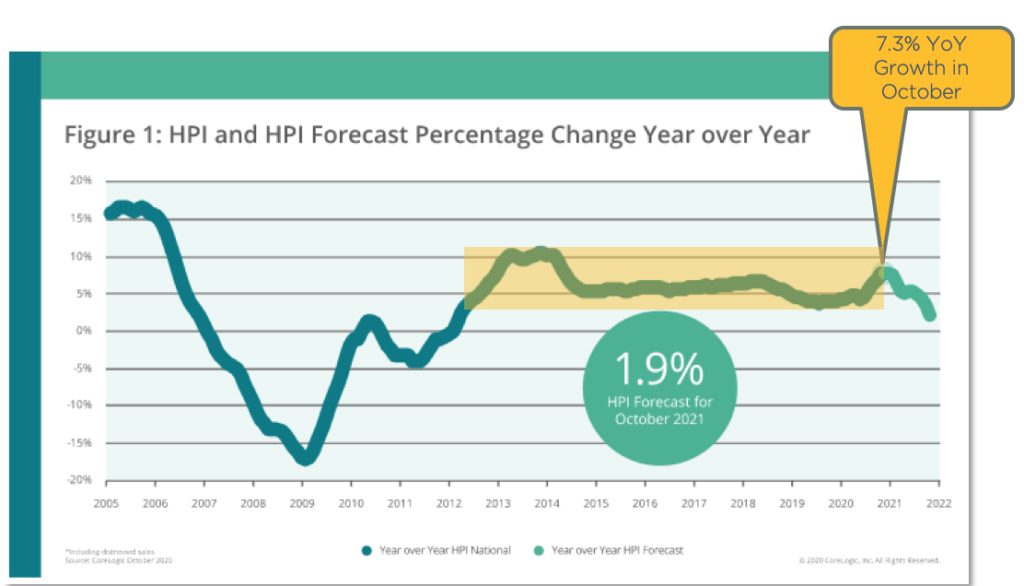
This chart shows home price growth, and you can see we were at the zero line in 2012. But since 2012, we’ve had roughly 5% annual home price growth across the US. As of October, 2020, average homes in the United States rose 7.3% year over year. The real estate market is smoking hot. We have been forecasting this for years, and I’ll tell you in a moment what’s going on and why.
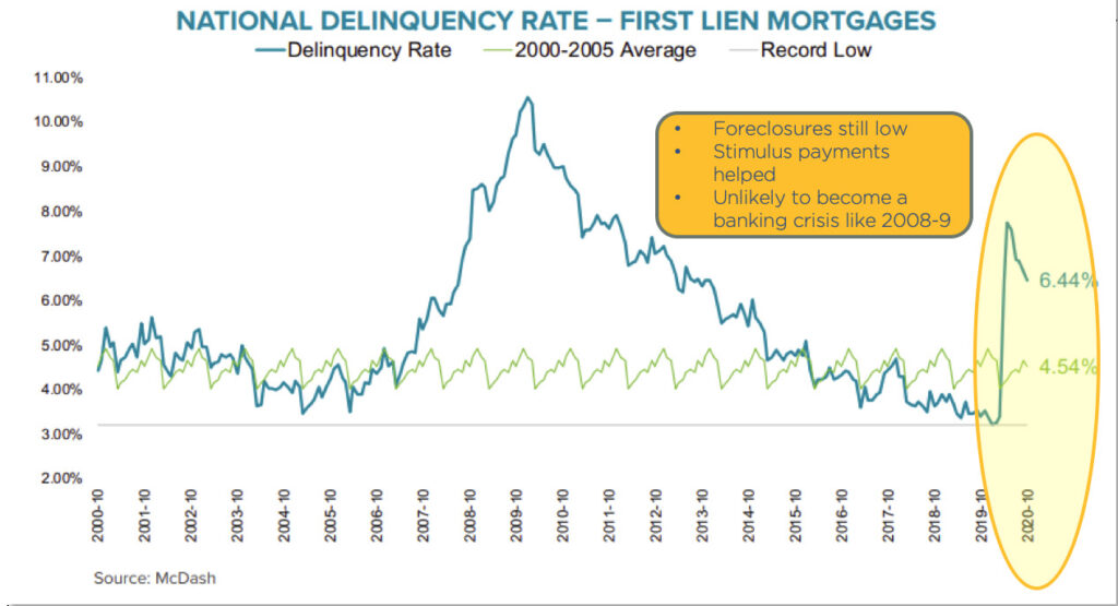
Mortgage Delinquencies Well Below Great Financial Crisis Peak
According to Black Knight who tracks mortgages, mortgage delinquencies are right now at about 6.44%. During the great financial crisis, they hit almost 11%. But of the 6.44%, only 0.33% of those are in foreclosure, well below the great financial crisis peak, but certainly concerning.
Foreclosures are still low, helped by the stimulus payments, and thus this is unlikely to become a banking crisis like what happened in 2008 and 2009. I’ll also dive deeper into this below.
5.3% of Mortgages In COVID Forbearance Plans
According to Black Knight, 5.3% of mortgages are in COVID-19 forbearance plans, reducing or suspending rent payments for renters. You can see it spiked up in May and has been dropping off.
Fannie Mae/Freddie Mac are required to forebear and there’s really no qualification necessary. So if a renter were to say, ‘Hey, I have a COVID-19 difficulty,’ basically they would have to forebear. Many of these forbearance plans are people simply putting money in their pocket who may or may not have a real challenge. So again, I think these numbers are inflated and not very concerning right now.
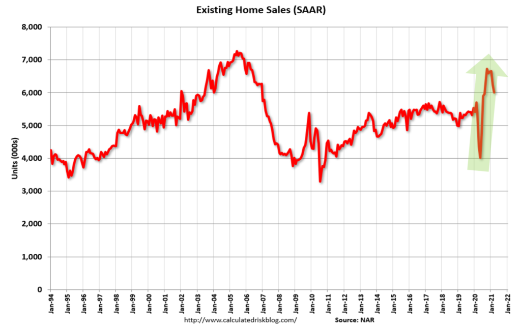
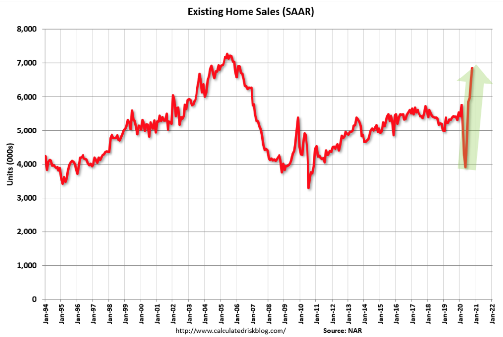
Home Sales Booming, Highest in Last 15 Years
Meanwhile, existing home sales are booming, hitting the highest point in the last 15 years. Take a look at the peak in 2005 and 2006. Even in the middle of the COVID crisis, home sales are absolutely booming.
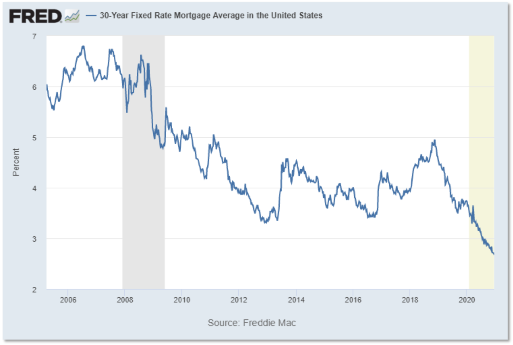
The 30-year fixed mortgage rate is one of the main reasons for home prices skyrocketing, hitting a record low of 2.67% at the end of 2020. These rates are crazy-low for a 30-year fixed mortgage. Mortgage rates have never been this low, so it creates a massive demand and stimulative effect on home prices.
Housing Prices By Metro Area
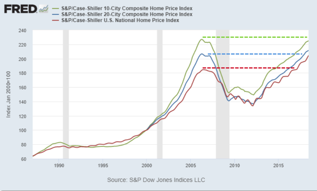
Housing prices are now above the 2006 peak except in the largest Metro areas. In the below chart, the red line is the national average. You can see the 2006 peak, how we’re now far above it.
The blue line shows the largest 20 Metro areas, and we’re now just above the 2006 peak. And finally, the green line depicts the largest 10 Metros, big cities like San Francisco, New York. In these metros we are not quite at the previous peak yet. So across the board, home prices have had a pretty dramatic recovery and are now close to or above the previous peak.
But after adjusting for inflation, let’s call it “real housing prices,” prices are still well below the peak in the largest metros, and close to the peak nationally. The chart below shows inflation-adjusted housing prices, and you can see we’re actually right about at the peak nationally. And In the 10 largest metros, we’re well below the 2006 peak. So after adjusting for inflation, nationally we’re 1% below the previous peak, and between 11-15% below the previous peak in the largest metros. So prices have not recovered to where they would be with inflation.
The Demand For Housing
Price-to-Rent Ratios Mean It’s Cheaper to Buy Than Rent
One of the major factors driving housing prices up is that it’s cheaper to buy than rent. Here’s the price to rent ratio. When it’s high, it’s cheaper to rent than to buy.
We’re still seeing prices about 20% below the peak. One of the factors we examine at Aspen Funds when we’re buying mortgages is whether the principal and interest payments of the borrower is below the equivalent rent payments. And we’re seeing sometimes the principal and interest payments are half of what you would pay if you were to rent the same house. Rents have continued to go up throughout the crisis, so it often makes it cheaper to buy than rent. If you have good credit and a down payment, it is cheaper in many metros to buy than to rent. So that’s driving up demand.
Housing Demand Driven By Supply Squeeze
The other factor at play is an acute housing supply squeeze. Today, we have only 3.3 months’ supply of houses in the US. This is an unprecedented shortage of homes on the market.
Housing Underbuilt for the Last 15 Years
Here’s the bigger story and why we have been predicting housing price gains for the past few years, including for 2021 and the next few years. The chart below measures new housing builds. The green line shows multifamily housing (structures with 5-units or more) starts and the blue line is single-family housing starts. Pre-financial crisis, everything was fairly steady and strong.
During the crisis, everything was crushed, and both multifamily and single family housing starts completely stopped. But notice what happened during the recovery: Multifamily builds recovered significantly, but single family builds never recovered. In fact, they’re still far below the lowest in the previous 20 years. Why is that?
If you built a home back in 2005, you could buy land, build a house, sell it, and you would actually make a profit. But today, if you were to buy a piece of land, build a house and sell it, you would generally not make a profit (there are some exceptions to this in the luxury market, but this generally holds true, especially at the lower end of the market).
The reason for this is because inflation has continued on for the last 15 years. The housing market took a dive, but inflation did not take a dive. So the housing market has not kept pace with inflation. Today your cost of land, building materials and labor have dramatically gone up. But prices when you sell it have not kept pace. Homes are underpriced.
There are two ways to fix this: either private homes need to be cheaper to build, which is not going to happen, or prices need to go up. This means there’s a shortage of supply coming onto the market. There are no new homes competing with existing homes, because they’re not being built. Why? Because you can’t make money doing that. This has helped to create a chronic supply squeeze.
Going back to the last chart, we’re actually seeing homes are starting to be built again. Currently, we’re still just above half of the level of new home builds as in 2006. So while there’s not a lot of homes being built, we’re starting to hit the bottom of normal range. This is a good sign to me, signaling that we’re going to see some new supply hitting the market. This housing starts line has to climb higher before we start to see any relief in housing price gains. Until then we’re going to continue to see housing prices for single family homes continue to go up.
This is the same chart, except now displayed relative to population. According to this data, not only are housing starts low, but the population of the United States has continued to increase. This further illustrates the chronic undersupply of new homes being built. We will continue to see a supply squeeze until housing prices rise enough to make new homes profitable for builders.
Debt Service – Consumer is in Great Shape
Here’s another amazing chart looking at consumer debt service. The consumer is in great shape in spite of COVID.
Look at the COVID impact in 2020. This is debt service payments as a percent of disposable income. Debt service is how much you spend on an annual basis on debt service relative to your income. We’ve seen a dramatic improvement in 2020 where people are spending less money on debt. Why is that? Well, income is going up, and interest rates are going down. So the consumer is actually in very, very good shape.
Housing Affordability is Increasing
Housing affordability is increasing. Now this may be counterintuitive to a lot of people. The below chart is my version of affordability, measuring personal income per capita divided by median home interest costs. If you bought the average home in America and you got a loan at the current interest rate, what are you going to pay in interest versus what you earn? And you can see it’s actually rising dramatically. Why is that? Well personal income per capita is actually up due to stimulus payments and unemployment payments.
*Personal Income Per Capita / Median Home Interest Cost
Housing affordability is improving because rising personal income per capita and savings from falling interest rates is currently outpacing the higher cost of housing. So again, it’s kind of surprising, but we’re seeing affordability going up and prices continue to rise as a result.
Are We in Another Housing Bubble in 2021?
There’s a lot of concern about a housing bubble. The chart below is current 2020 data from CoreLogic, who looks at mortgages. Today, mortgage underwriting is far more conservative than in the early 2000s. This is the share of conforming conventional homes purchased with the debt-to-income (DTI) ratio above 45%, meaning you’re spending more than 45% of your income paying your mortgage.
You can see 2006, which was the peak of the previous housing bubble, was at a pretty high number. Today it’s not anywhere near that.
And here is the share of conforming home purchases with a loan-to-value (LTV) ratio above 95%, meaning loans with a 5% down payment or less. How many homes are bought with 5% down? Well, it was a significant number back at the peak of the housing bubble. Today it’s far lower.
Perhaps even more important is this chart, also from CoreLogic, showing six factors of credit quality. What’s interesting here is the percentage of low doc/no doc loans, of which there are almost none today. These types of loans were a significant portion of loans back in the great financial crisis. With a low doc/no doc loan, you basically state your income and don’t need to provide documentation to prove it. Today these simply do not happen a significant amount.
And the second factor to look at in this same chart is the below 640 credit score loan originations. Again, very, very small relative to what was happening in 2000.
Today we’re seeing every measure of origination loan credit quality is far, far more conservative than it was in 2000. Especially the greatest risk areas, below 640 credit score and no doc/low doc loans. So bottom line there’s no way we’re in a housing bubble right now.
Real Estate Forecast 2021 Bottom Line
We’re going to see record strength continue in the housing market. CoreLogic is forecasting 1.9% growth in 2021 (I don’t know how they get that number after seeing 7.3% growth in 2020). Zillow is forecasting a 10-12% growth in 2021. Our estimate is that growth will be at or above the 2020 level, so 8-10% growth in 2021. Again, this is because of all the reasons we’ve said: fewer new homes being built, low supply, low interest rates, higher affordability, low price-to-rent ratios and a consumer that is very, very healthy. Basically every fundamental we examine is strong, so we expect to see a very good year for single family homes.
For commercial real estate, multifamily, and office, the global interest rate compression will keep cap rates low. Today global interest rates are low, zero, and negative, meaning if you put your money in a bank you would pay the bank to keep your money. Low and negative interest rates are driving cap rates down globally. So if you have $1 billion, are you going to put it in a bank and pay a bank to keep the money? No, you’ll do pretty much anything else, like buy an apartment complex, etc. This creates a massive amount of liquidity and keeps cap rates low, and cap rates determine prices. So prices are going to continue to be high for the foreseeable future.
Global interest rate compression is a byproduct of stimulus. It’s also a byproduct of policy and it’s unlikely to change anytime soon. Interest rates are going to continue to be extremely low and that is simply going to boost multifamily and office prices. I don’t know how much upside there is in those, but I don’t think there’s a significant downside.
Office demand will significantly soften as working from home becomes permanent for some or many workers. Even if the current 80% of the workforce working from home becomes 20%, that’s still 20% less demand for office space. However, since most office space is on long-term leases, impact is not immediate or acute. So we’re going to see softening, but it’s not going to be a big problem.
There is a huge opportunity in distressed properties within Retail and Lodging. As we said before, 24% of hotel lodging debt was in special servicing, which means loss mitigation. This is a huge opportunity for distressed properties possibly selling for 50 cents on the dollar, for those who want to move into that area.
Recap & Next Article
Up to this point, we’ve covered what happened economically in 2020, where we believe the economy is headed in 2021, how Biden’s proposed tax plan with impact the economy, and where the housing market is headed.
Mr. Fraser has 20+ years’ experience as a finance and technology executive and is a former E&Y Entrepreneur of the Year Award winner. In 2012 Fraser co-founded Aspen Funds, a fund management company focused on mortgage investments. Fraser is responsible for financial management, portfolio modeling, as well as systems and processes, designing and deploying Aspen’s scalable state-of-the-art back-end platform.
Join Our Mailing List
Get the latest in investing advice, industry news and updates on our current and new offerings
Part 3 of our 2021 economic forecast will examine Biden’s proposed tax plan and it’s effect on the US economy, including an overview of the proposed changes and their impact on investments and asset prices, as well as minimum wage increases and unemployment rates, and post-crisis stimulus and recovery.
And in case you missed them, here are part 1 and part 2 in the series.
At the time of writing, it’s unknown whether or not Biden will be able to get his plan pushed through. But for the sake of this forecast, I’m going to assume that the Biden tax plan passes and we’ll look at its potential economic effect in 2021. Let’s dive in.
The Biden Tax Plan Overview
The biggest change reflected in the proposed tax plan is a rise in the long-term capital gains tax rate, which would almost double from a 20% capital gains to a 39% capital gains tax. This means that if you buy an asset, hold it over a year and then sell it, you would pay about 20% on the revenue pre-Biden. Post-Biden, you’re paying almost 40%. This is a massive increase, and we’ve never seen anything like that.
While we can’t see the future to predict exactly what will happen as a result of this increase, we can look at past similar scenarios and what happened in those cases.
The other big change is the corporate income tax rate. In 2018, Trump passed a 21% rate, massively reducing the corporate income tax rate. Biden proposes to increase it to 28%, a fairly significant increase, and reintroduce the alternative minimum tax. There were several other changes in the new plan as well, but I’m not going to spend time on them as they’re smaller and less impactful. We’ll focus here on the first two measures.
What’s the Impact on Businesses from the Long-Term Cap Gains Tax Rate Increase?
With the long-term cap gains tax rate increase from 20 to 39% applying to income over a million dollars, it’s primarily going to affect businesses or wealthy individuals.
The below chart is from Goldman Sachs and they look at the impact of previous capital gains tax increases in 1987, 1988 and 2013.
What happened in those cases is tri-fold:
The S&P 500 initially dropped significantly, but then recovered within six months.
The household equities dropped, which is the investment of households in the stock market.
Momentum dropped but then recovered.
In all three of these cases there was a felt impact, but recovery soon followed. My opinion is this is going to have a chilling effect on investment and prices, primarily in real estate and the stock market.
Combined with elimination of 1031 exchanges, the Cap Gains Tax increase could have significant depressive effect on RE liquidity and pricing
Combined with the elimination of 1031 exchanges, this tax hike is going to have a significant depressive effect on real estate, liquidity and pricing. With a 1031 exchange, you can sell an existing property, buy a new property, and in essence swap out your cost basis and defer your taxes. This has been a pretty big tax savings for real estate investors.
Here’s Goldman’s take on the elimination of 1031 exchanges: “Eliminating 1031 exchanges would likely lead to a decrease in commercial real estate prices in many markets, less reinvestment in commercial and residential real estate, greater use of leverage to finance acquisitions, and an increase in investment holding periods that would result in a decrease in market liquidity and a slowdown in related industries.” So a lot of people will simply hold their existing property rather than sell and pay the taxes. It means fewer properties available for sale, and less liquidity in their terminology. It also means possible sell-off in stocks and commercial real estate prior to a cap gains tax increase.
Possible sell-offs in stocks and commercial real estate prior to cap gains tax increase
So again, according to Goldman, “history shows stock prices fall, equity allocations decline, and Momentum underperforms ahead of increases in capital gains tax rate. However, any potential equity selling will be short-lived and reversed in subsequent quarters.” Goldman believes it’s going to possibly create a sell-off, but there will be a quick recovery. I’m not so sure because of the sheer magnitude of the increase. I believe that because we have never seen a doubling of taxes and capital gains combined with 1031 exchanges, the effect could be more pronounced.
The other thing that’s very different from these periods that Goldman mentioned is that today’s wealthiest households are sitting on $1 trillion in unrealized equity gains.
Let’s say you’re an investor and you have $1 billion in unrealized gains and you know the tax rate is going to double on January 1st, what are you going to do? You’re going to sell ahead of the tax change, pay your taxes, and then maybe buy it back.
So we’re going to see a big selling crush. The unrealized equity gains is currently about 4x larger than it’s ever been, and there’s a lot of incentive to sell. If the tax plan passes in 2021 and becomes effective on January 1st of 2022, I believe we’ll see a possible market selloff in Q4 2021 in anticipation of that. And it may have a slight depressive effect on long-term prices.
We’re already seeing the beginnings of a selloff in private mergers and acquisitions, with a lot of privately owned companies looking to sell. Many wealthy business owners who are looking for exits are already moving M&As forward in order to save in taxes. So this is possibly a very significant tax increase.
The Corporate Income Tax
The factor that may have the biggest economic impact in 2021 is the corporate income tax increase from 20% to 28%.
The Trump tax plan implemented at the beginning of his term reduced corporate taxes to global norms. Prior to this tax change, the US was one of the highest tax jurisdictions in the world for business taxation. At that point, tax law penalized US-based businesses. The US was the only country in the world that actually demanded that US corporations pay taxes on foreign earnings. So if you have a foreign subsidiary, you pay US taxes on when those earnings came home.
And so what happened is that businesses basically didn’t pay the taxes, they just held them in those foreign entities. Trump’s tax plan allowed them to repatriate all that cash–it was trillions of dollars–and pay their taxes on it. This eliminated this very weird disparity of the US corporate taxes in the globe. My prediction at the time was that it was going to dramatically impact the economy, and it did.
How Corporate Income Tax Affects Unemployment Rates
This tax change was the single largest factor in driving pre-COVID unemployment rates to historical lows. This is the unemployment rate for black or African-Americans, which we saw literally setting a record low.
And for Hispanics as well, also a record low we’ve never seen before.
Contrary to politicians’ economic fantasies, jobs are created almost entirely by healthy businesses. When businesses are healthy, they hire people. And that’s exactly what happened after this tax change. As these businesses were flush with cash, they began hiring, and you see the unemployment trend continue downward in the chart.
How Will an Increased Minimum Wage Affect Businesses and the Economy?
Biden has also pledged to boost the minimum wage to $15 an hour. I understand that this move is born from the desire to create a livable working wage for all, but in actuality it has a very harmful effect.
Raising minimum wages will have a very detrimental effect on the marginally employable and on youth looking for their first job. Think about someone coming out of high school, most of whom have no skills whatsoever, and who may not have really developed a good work ethic. What would someone pay them $15 an hour to do where it actually makes financial sense?
For part-time workers and those without deep skills and job history, a minimum wage increase is going to have a very, very negative effect. A friend of mine runs a computer recycling business where he pays those in homes for the severely mentally handicapped to disassemble computers. If he had to pay them $15 an hour for this job, he wouldn’t be able to afford to employ them.
A minimum wage increase has a long-term effect of delaying and/or preventing the marginally employable from entering the workforce. That first job is so hard to get and raising the minimum wage, essentially increasing the high-jump bar for that first job, creates a long-term burden of support on society and will disproportionately affect the poor and people of color, unfortunately.
US workers compete for jobs with globe and automated solutions
What a lot of politicians don’t realize is US workers compete for jobs with global workers and automated solutions. We’re already seeing automated kiosks at McDonald’s and other places because it’s cheaper to spend $10,000 on a kiosk than it is to hire a worker. So a worker competes with a computer or an automated solution, but also competes with global workers (not in the case of McDonalds, but more in the manufacturing space).
A minimum wage increase will have a depressive effect on employment, unfortunately. I appreciate the heart behind doing that, but the increase needs to be tailored so that there are exceptions to the $15 per hour rule. We’ll see what actually passes. If there are exceptions, then this will have not as detrimental an effect.
Stimulus Measures Supersede All
The bottom line is the stimulus measures supersede all. According to Goldman Sachs: “our political economists outlined roughly $7 trillion in gross fiscal expansion spread out over several years that Biden has proposed, including roughly $2 trillion of front-loaded COVID-realted stimulus as well as spending on infrastructure, healthcare and other policies.”
Whether Biden’s stimulus ends up $1 trillion or $7 trillion, this is going to produce a massive stimulative effect. This really trumps everything else. We’ll see as Biden takes office what actually he is able to pass.
For comparison, early 2020 stimulus measures totaled $2 trillion with another $0.9 trillion in December. Even if no additional stimulus passes in 2021, we are still going to see a fairly strong economy as the stimulus that’s already been spent begins to work it’s way through the economy. But if the stimulus measures continue, we’re definitely going to see a boom, again, primarily affecting asset prices.
A lot of people are concerned about the deficit spending and the monetization of debt that the Federal Reserve is doing, which we covered in part 2 of this series if you’d like to read more.
The Biden Tax Plan Bottom Line
Obama was elected at the tail-end of the great financial crisis, and his term was marked by historical stimulus and deficit spending–both central bank and government spending–and emphasized social spending and policy. But the recession was just stubborn, and we could not get out of it. The below chart shows job losses since post-World War II recessions. Most recessions took a couple years to recover.
But notice the blue line, the 2007 employment recession during Obama’s presidency, took six and a half years to recover. Now, it was deeper than other recessions, but it was also a much slower recovery. This was partly because it was a systemic crisis, but partly because social spending doesn’t necessarily help the economy or jobs. The historical level of spending during Obama’s term basically increased asset prices but not the economy or jobs. We saw slow job recovery, but great asset price recovery.
Biden’s economic legacy might be similar to Obama’s. Biden was elected at the tail-end of the COVID crisis, his solution is very similar to Obama’s and I expect to see the same two results: 1) massive asset price inflation and 2) a slower jobs recovery. However, job recovery during Biden’s presidency will not be as slow as during Obama’s because the COVID-19 shock is an exogenous shock versus systemic, it’s an external shock.
If you look at the red line in the above chart mapping out the employment recession during 2020, you can see the extreme speed of the job losses. But we also have seen nothing like the speed of this recovery. So again, because policy makers and Congress acted so quickly with stimulus measures, I would expect to see unemployment continuing to improve, and I believe it will not take as long as the 2007 recession to fully recover.
Recap & Next Article
Up to this point, we’ve covered what happened economically in 2020, where we believe the economy is headed in 2021, and how Biden’s proposed tax plan with impact the economy.
Mr. Fraser has 20+ years’ experience as a finance and technology executive and is a former E&Y Entrepreneur of the Year Award winner. In 2012 Fraser co-founded Aspen Funds, a fund management company focused on mortgage investments. Fraser is responsible for financial management, portfolio modeling, as well as systems and processes, designing and deploying Aspen’s scalable state-of-the-art back-end platform.
Join Our Mailing List
Get the latest in investing advice, industry news and updates on our current and new offerings
In this 2021 economic forecast, we’re looking at the major trends and tides that are affecting our economy and our investment world. In part one, I shared about the general economy and what’s happening. And in this part, we’re going to look at the coming COVID recovery and what’s likely to happen for our economy throughout 2021.
Vaccine Rollout Will be Met With Skepticism
At the time of writing, the first two vaccines have been approved, with more in the works. One of the trends we’re seeing is a lot of people are saying they’re not going to take the vaccine. This is from the Wall Street Journal.
In the US, roughly 60% of people said they would take the vaccine if it’s available. These vaccines are clearly pretty safe, but if people don’t believe that then they’re not going to take them. A low vaccination rate is a risk to economic recovery.
Of the people that indicated why they wouldn’t take the vaccine, about 25% are worried about the side effects. Another 35% are worried that it was pushed through clinical trials too quickly. Roughly 10% more think it wouldn’t be effective. And others, probably young people, think they are not much at risk for getting COVID. Vaccine adoption is likely to be slower than one might anticipate.
And here’s perhaps the most important chart, this is from Goldman Sachs. Goldman is forecasting 50% of the US population will be vaccinated by May. So this vaccine is being rapidly rolled out with a massive logistics and deployment effort.
The CDC has highlighted who will get this vaccine first, and unsurprisingly, it’s healthcare workers and those that are high-risk. Goldman also points out that this method of vaccinating the higher risk people first means that the hospitalization rate is going to drop much faster than the infection rate. So we’re going to see a lot of pressure quickly coming off the economy and off hospitals as we roll through 2021.
So with 50% of the population vaccinated and possibly a much higher number of at-risk people vaccinated, we’re going to see a rapid end to the record death rates and the hospitalization rates that we’ve been seeing.
Timeline for COVID Vaccine to Positively Impact Economy in 2021
The Bank of America fund manager survey asked fund managers when they expect a positive economic impact to hit from the vaccine. About 70% of fund managers believe it’s going to happen in Q2 or Q1 of 2021, which is exactly what I would say. We’re seeing the beginning of the end of the COVID crisis, primarily due to this vaccine.
GDP Projections in the Wake of COVID Recovery
What about the economy? The chart below shows the real GDP with the percent change from the preceding quarter. This is the change in GDP in annualized numbers.
Now the GDP is the entire economy of the United States. So when we saw a 33% decline in Q2, that was absolutely extraordinary, we’ve never seen anything like that. The huge drop was due to consumers not spending, not traveling, and the economy literally being shut down. A 33% drop means a third of the economic activity in the United States stopped. If that trend wasn’t halted, we would certainly have been in another great depression.
But in Q3, we saw a 33% GDP gain. This growth really blew past what most economists were predicting. The PPP program, the stimulus spending, the direct payments to individuals all contributed to this GDP growth. When you actually drop money into people’s bank accounts, that is about as stimulative as you can get. Same thing with the PPP program dropping cash quickly into businesses, it had a massive and immediate impact.
Direct payment stimulus programs like these are much different than a tax change or something else that may take two or three years to roll through the economy. They are immediate and intense. So while a lot of people are very critical of the stimulus programs, I’m not. They’re certainly imperfect, but given the fact that the government put them together in a matter of weeks and actually executed them, they were exactly what was needed and far preferable to a perfect program that takes a year to roll out. These programs nipped a potential depression in the bud.
So what about GDP in Q4? The Blue Chip consensus, which are the big economists, are now predicting a plus 4% growth in Q4 GDP. The Atlanta Fed’s GDP Now model is currently predicting 11% GDP growth for Q4, which would be extraordinary if we do see that. Given the second stimulus package coming, we’re probably going to continue to see strong growth throughout Q1 of 2021. Our nation and, in a large part the globe, took the right steps at the right time and averted what could have been an incredibly difficult crisis, giving us a very bright hope for 2021.
The Spring 2020 Stimulus Plan Impact on Economy
The spring 2020 global stimulus was about $8 trillion. This is a great example of the economic tides that drive investment that I look at when making economic projections.
The US stimulus was $2 trillion, and doesn’t include the nearly $1 trillion coming at the end of 2020. $8 trillion in global stimulus is a very, very large number. I put this chart in here just for scale. Here’s the GDP of the United States, $21 trillion. So when you’re talking about an $8 trillion global stimulus, or $2 trillion US stimulus, that’s equal to 10% of the GDP of the United States.
We should look at stimulus from a global perspective, because money is global today. When there are trillions of dollars pumped into the economy in Germany, a lot of that money is going to find its way to the United States (or any other investment location), so money is truly global. According to Morgan Stanley, $2.8 trillion in central bank bond purchases are expected this year. This is a huge amount of stimulus.
Stimulus Measures and How They Impact the Economy
When we talk about a ‘stimulus’ plan, there are actually several different measures the government can take to stimulate an economy. Here are the major stimulus efforts in order of increasing intensity.
(These measures are in order of increasing intensity, as well as a timeline).
The two mechanisms used to fuel the stimulus (represented by the two circles in the center of the diagram) are 1) government spending where the government writes checks, which has a stimulative effect depending on who the recipients are. And 2) the central bank (Federal Reserve) purchases things, also creating a stimulative effect.
Now initially, stimulus was mostly just government spending. But we’ve started to see a gradual increase in the effectiveness and impact of the central banks’ purchases over time.
Tax Breaks
So initially, about 100 years ago, tax breaks were really the only tool that the fiscal planners and the fiscal policy makers had, and they can still be very effective. When the Trump tax plan came into place in 2018, I said it was going to be a game-changer in terms of jobs. Tax breaks can boost jobs and they can boost investment. And depending on how they’re constructed, they can boost consumer spending too. Trump’s tax break was especially friendly to businesses, and since businesses are primarily the driver of job creation, we still have quite a bit of benefit today from these tax measures.
When looking at stimulus, many people focus on the area of direct payments to individuals, the headline numbers — the $2 trillion, $900 billion. But what they miss is the fact that we have a lot of other stimulus measures in place too, including tax breaks and low interest rates.
Low Interest Rates
The next tool came with the advent of the Federal Reserve in the early 1900s. The Federal Reserve had a mandate to basically keep inflation low and keep growth steady. They did this primarily by manipulating interest rates.
Low interest rates boost investment and increase asset prices. This has been a tool used for over 100 years to stimulate or slow the economy. For example, the double-digit interest rates back in the ‘70s and ‘80s were a drag on the economy. But conversely, when interest rates drop very low, it’s a boost to the economy.
Interest rates today are exceptionally low, about 1%. And that is extremely stimulative, primarily boosting investment and asset prices, as well as helping businesses. Most people overlook low interest rates in stimulus measures, but this is a major boost to the economy.
Government Guarantees
Next came Government guarantees, which are when the government backs an investment. This has happened in the past with the mortgage giants. The government backed the bonds issued by sponsored entities (GSEs) like Fannie Mae and Freddie Mac.
When investing in a bond that’s backed by the government, the price is much higher and thus the interest rate is much lower. This has the effect of basically lowering costs and increasing access to private capital, and doesn’t necessarily cost the government anything unless there’s a default. Only if that guarantee is actually used does it cost the government, but it massively benefits the economy and is hugely stimulative.
Right now the GSEs buy most of the US mortgages, and that keeps interest rates super low and it doesn’t cost anything unless they fail, which is rare.
Direct Debt or Equity Injections
The next stimulus measure is direct debt or equity injections, where the government actually takes a stake in a company. One example of this was in the 1980s with Chrysler and the direct equity injection. Chrysler was ready to declare bankruptcy, which would have resulted in losses of perhaps hundreds of thousands of jobs, but the government made a direct loan to Chrysler.
Another example was in the Great Financial Crisis when the government lent $182 billion to insurer AIG in exchange for 80% of the equity (the stock), becoming the biggest owner of AIG, a public company. This was the right move because AIG had become the key player in the financial plumbing of credit default swaps. They had made a huge mistake and had underwritten the credit of all these big lenders who were in trouble. And as the insurance provider, they were going to go under. It would have thrown the financial system in complete and utter chaos had they failed, so the government bought the equity to keep them afloat.
Another example was with the TARP program during the Great Financial Crisis. In the TARP program, the government directly purchased assets. The government is directly lending or buying equity, essentially taking a stake in a business. Generally with these investments there’s no cost until there’s actually a default.
In AIG’s case, a lot of people were upset about the $182 billion loan to AIG, a failing company. Well, when the government got out in 2012, they actually made a $23 billion profit. They were able to get the company through the crisis and then close the loan. So there’s generally no cost until default.
The latest version of direct injections is the PPP program, though the PPP program is different because it’s forgivable, so there is a cost.
During the Great Financial Crisis, the role of the central bank began to eclipse government spending. Central banks are taking a bigger role, due to a popular theory that’s gaining momentum, called Modern Monetary Theory, or MMT. The theory is basically that government deficits and monetization of debt and expenses can help the economy without cost. And the theory is proving out. There’s definitely a downside to deficits and monetization of debt, but it’s not as extreme as most people are fearing.
So to recap, starting in the 1980s and then continuing in the 2008 timeframe, we’re seeing direct injections, and we’re seeing a rise of the central bank and its role in stimulating the economy.
Direct Payments to Individuals
The final stimulus measure is direct payments to individuals. In Ben Bernanke’s Fed Chairman days, people were concerned about deflation. But he said there’s no way we should be worried about deflation happening in our economy because, if need be, we can fly helicopters and drop money on people and create inflation. And so it was jokingly called ‘helicopter money.’ And lo and behold, our latest COVID programs in 2020 created helicopter money, or direct payments to individuals. That money was not raised from tax dollars, but from the central bank. The central bank, in essence, prints money and gives it to people.
How Does Stimulus Impact Inflation?
It’s helpful to think about inflation as two different kinds, one is consumer price inflation, or the price of your milk and your bread and your rent. This is what most people think about when they think of inflation. The other kind of inflation is the price of assets, such as the price of your home, the price of the stock market, the price of gold.
A lot of people are concerned that stimulus measures are going to create inflation. Well, since 2008 it has not, as I showed in the first part of this series.
However, we are seeing the second type of inflation, asset price inflation. The stimulative measures have the primary effect not of increasing consumer price inflation, but increasing asset prices.
In this last category of stimulus measures, the second mechanism in my diagram, we saw $7 trillion in central bank direct purchases in 2020.
The central bank balance sheets outline what is owned by central banks. If the central bank makes a loan to a business, they print money and they buy equity. This will go on their balance sheet and increase its size.
The above chart shows the balance sheets for the largest central banks in the world, the Swiss National Bank, the Bank of England, the Federal Reserve, the European Central Bank and the Bank of Japan.
You can see about $3.5 trillion at the beginning of the Great Financial Crisis. Today their balance sheet is $23 trillion. This represents money they have “printed” to buy stuff. This has a hugely stimulative effect and inflationary effect, but primarily in terms of asset prices.
The other stimulative mechanism used is deficit spending. Deficit spending is when the government borrows money (by selling bonds) and spends it. The following chart shows recent deficit spending. During just the Obama and Trump years, we’ve seen $18 trillion in US deficit spending, an enormous amount. Additionally we’ve seen $6.4 trillion in US Federal Reserve purchases, and $19 trillion in global central bank purchases. Massive amounts of money are flowing into the economy, and this is the economic tide that has more effect than any other factor.
Our 2021 Economic Forecast Bottom Line
We’re going to see a solid GDP growth in 2021. It will be in the higher range through 2021 as consumers exit COVID19 and begin to spend. People are flush with savings and are sick of staying in their homes. They’re going to travel, they’re going to go to restaurants, they’re going to go to bars. We’re going to see high GDP growth as soon as confidence returns.
We’re going to see unemployment continue to drop, but not to the Trump era lows and we’ll talk about why in another part in this series
The economic tide–this is the biggest point here–is government stimulus and excess liquidity will continue to roll through the economy. Its primary effect will be the lifting of asset prices. This is the time to be owning assets. There’s a lot of concern that the rich are getting richer and the poor are not benefiting. This is primarily the result of stimulative policies having the effect of increasing asset prices. So those people that own assets are the primary beneficiaries, and the people who own assets (stocks, homes, etc) are the wealthier. As these things go up, you’re seeing this wealth disparity continue to increase.
Many small businesses failed and many job losses were permanent, but the PPP program saved the US from the worst of it. With the second stimulus and vaccine rollout we should see a strong recovery of small businesses and jobs. The risk of a second great depression has been averted by stimulus efforts and a fast vaccine response.
Recap & Next Article
Up to this point, we’ve covered what happened economically in 2020, and we believe the economy is headed in 2021 as we begin COVID19 recovery.
Mr. Fraser has 20+ years’ experience as a finance and technology executive and is a former E&Y Entrepreneur of the Year Award winner. In 2012 Fraser co-founded Aspen Funds, a fund management company focused on mortgage investments. Fraser is responsible for financial management, portfolio modeling, as well as systems and processes, designing and deploying Aspen’s scalable state-of-the-art back-end platform.
Join Our Mailing List
Get the latest in investing advice, industry news and updates on our current and new offerings